With the anticipated release of the movie ‘Asteroid City’ coming up, Tal Solomon Vardy had an exclusive interview with Erica Dorn, graphic designer and illustrator, in which she uncovered the entire design process.
Dorn has been working with Wes Anderson since his animated film ‘Isle of Dogs’, and meticulously designs all graphic and typographic elements in his films: signs, patterns, custom-made fonts, backdrops, vending machines and more, based on spectacular historical research.
Asteroid City. Courtesy of Erica Dorn/Pop. 87 Productions/Focus Features
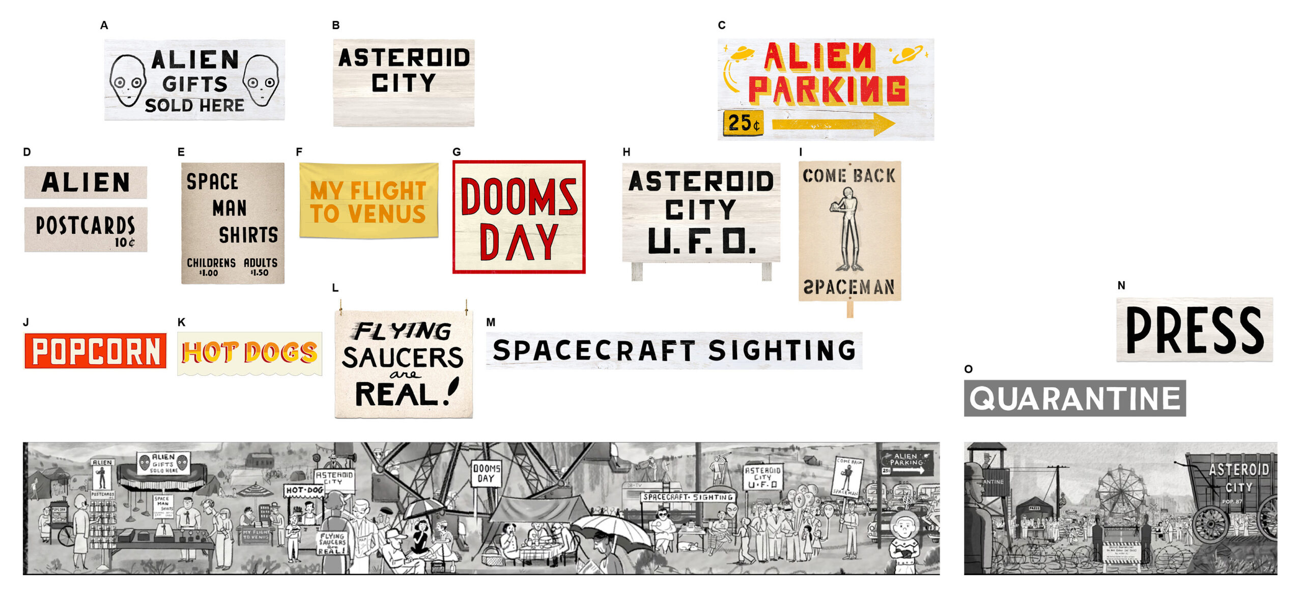
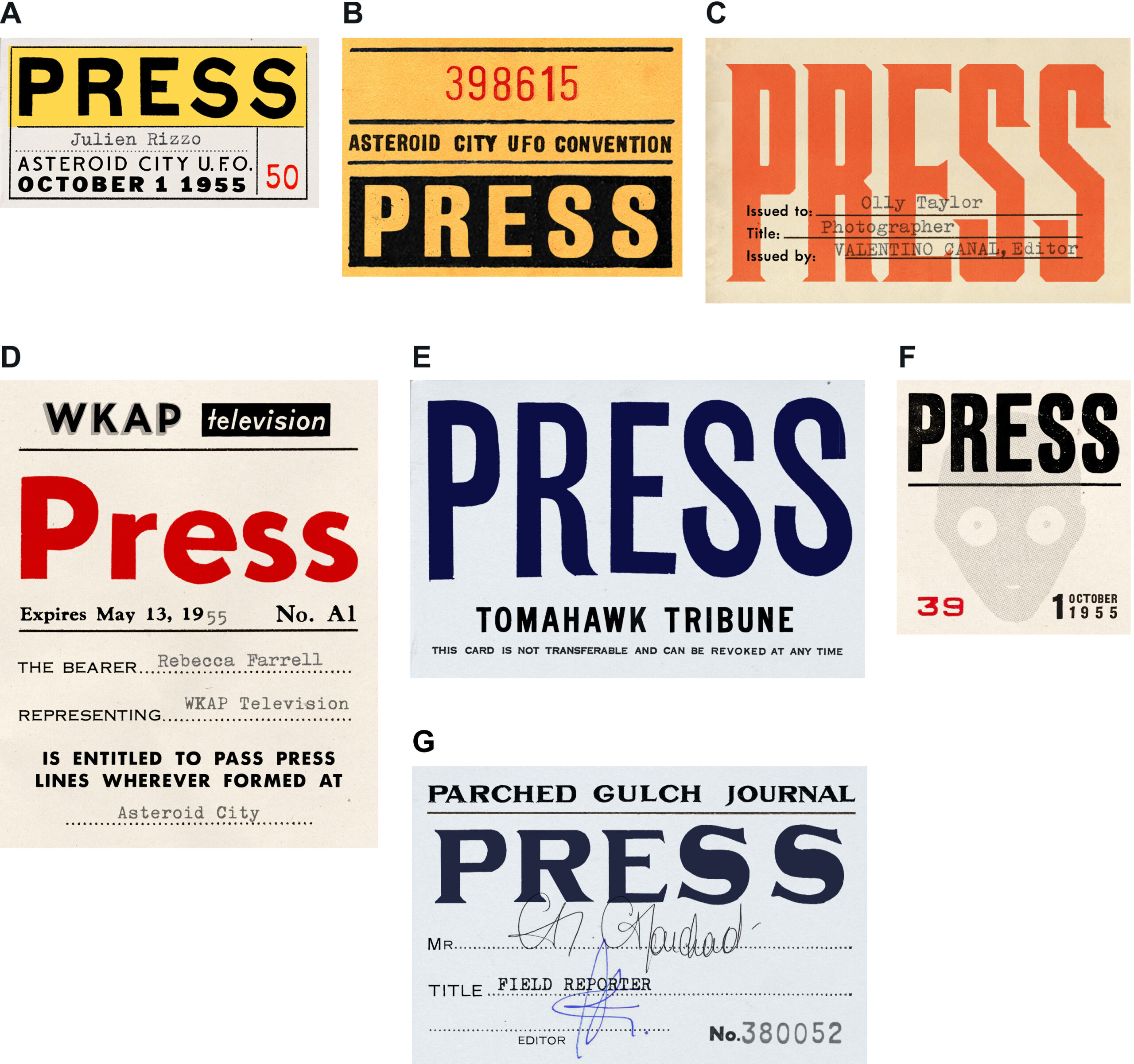
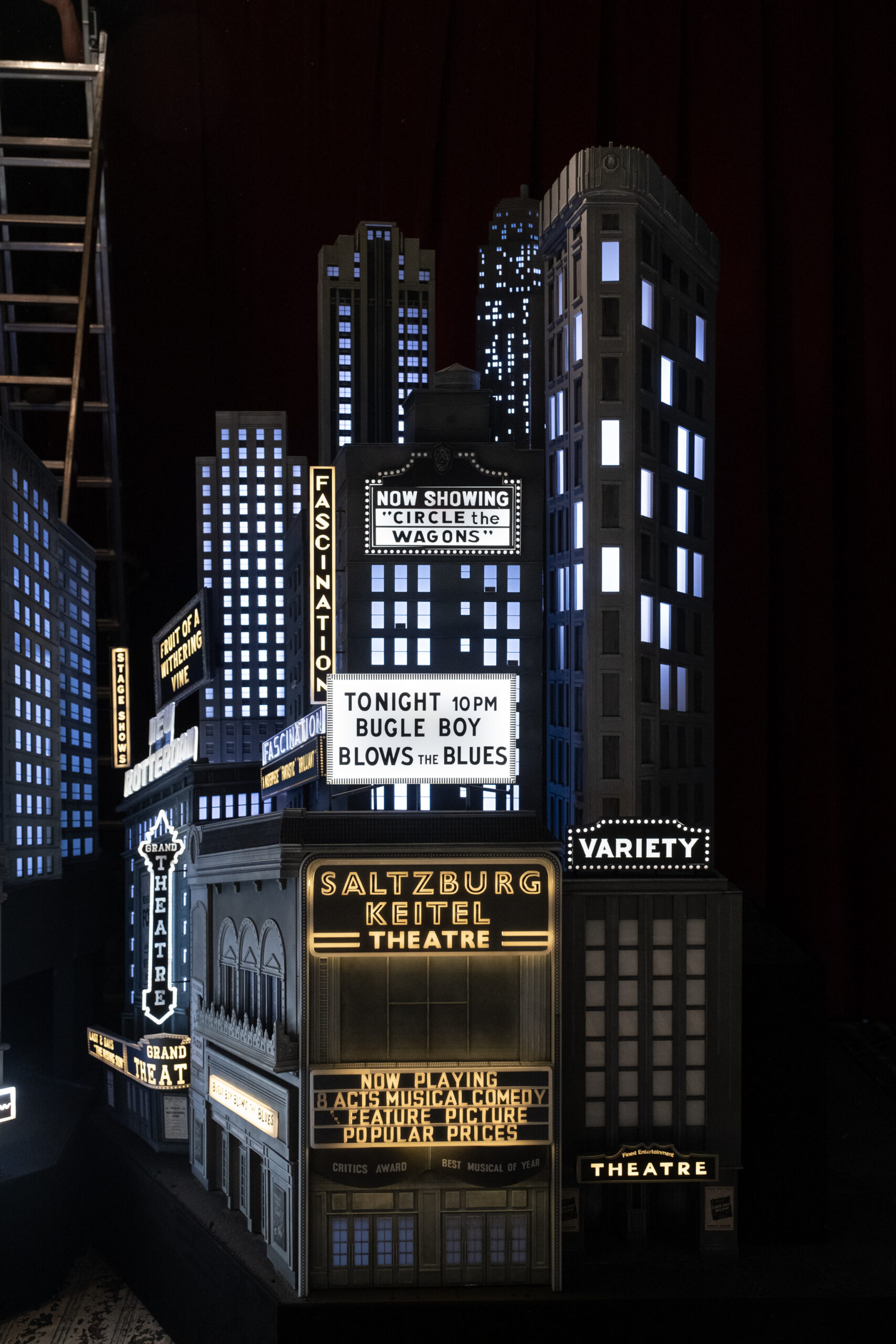
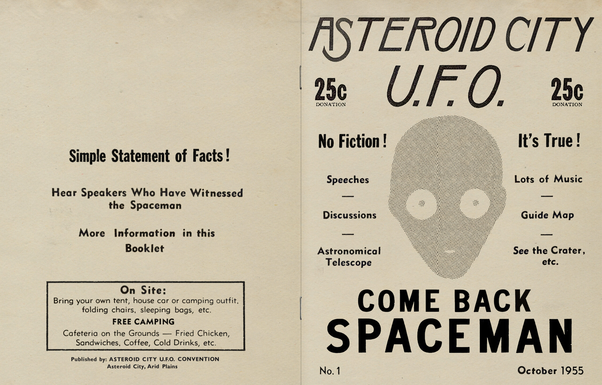
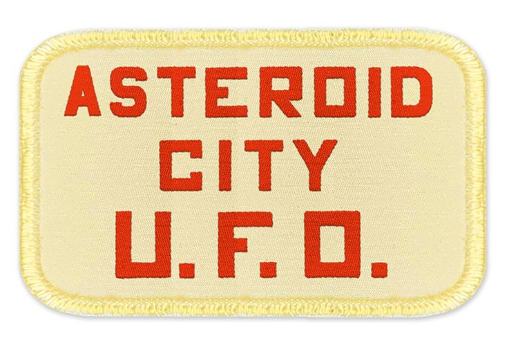
The typographical signs in ‘Asteroid City’ are hand drawn, based on in-depth historical research done on fonts and graphic designs from the 1950s, the time in which the plot takes place. The fonts are nameless, for one simple reason – Erika Dorn designed them from scratch. As in Wes Anderson’s previous films, the high quality of the production allows us to dive into 100 minutes of escapism that is purely contemplative and briliiantly aesthetic.
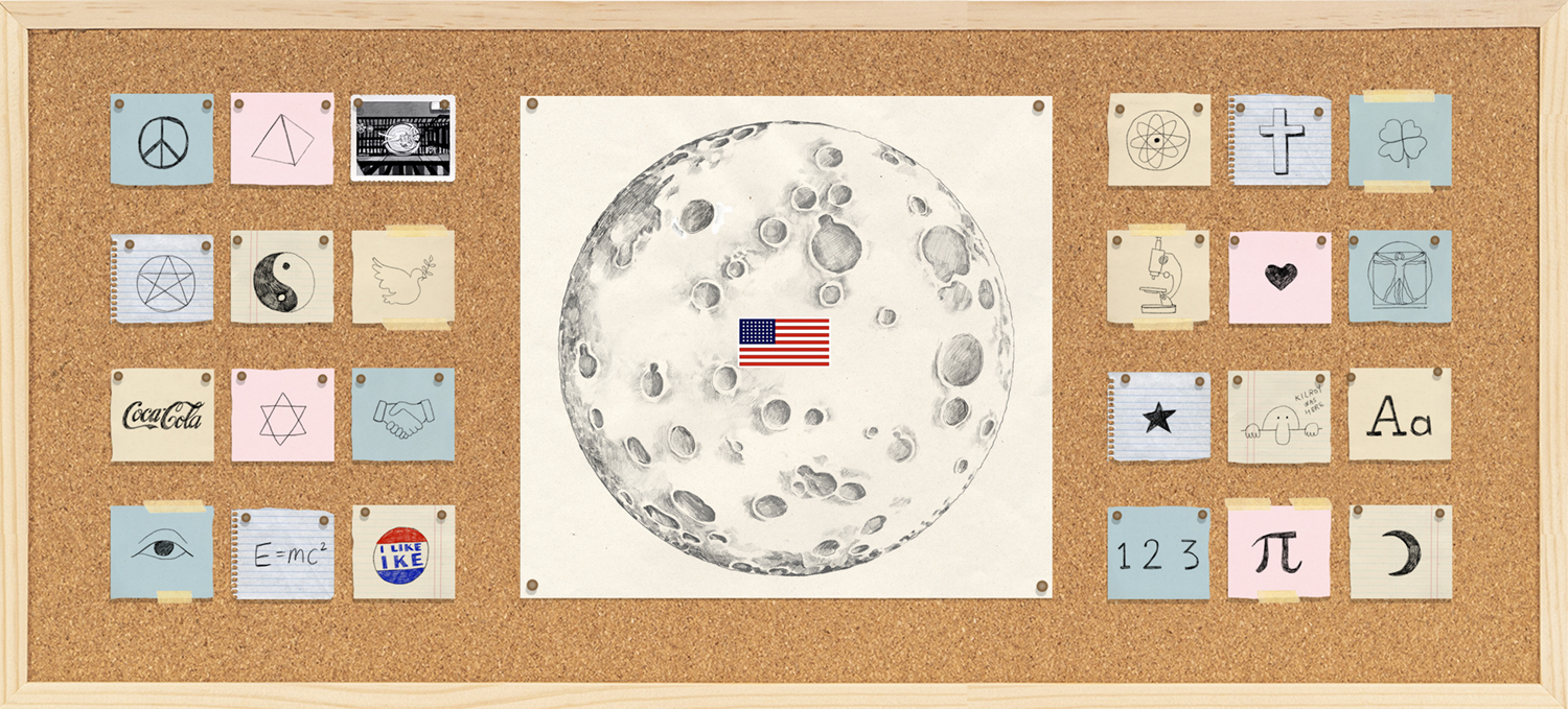
Wes Anderson’s Asteroid City takes place in a fictional American desert town around the year 1955. During the annual meeting of the Stargazers and Space Cadets convention in the remote town, the convention is disrupted by unusual events, and the convention guests discover that they are not allowed to leave the town and are compelled to form surprising connections amongst themselves.
Although the script was written long before the Covid pandemic outburst, there is no doubt that it hits the mark on the surreal situation that the world has gotten into. This is one of Anderson’s most exciting films, fueled by detailed dialogues, and it is clear that the production constraints of the global pandemic made it even more personal.
Courtesy of Erica Dorn/Pop. 87 Productions/Focus Features
Courtesy of Erica Dorn/Pop. 87 Productions/Focus Features
Erica Dorn is a British graphic designer and illustrator, who grew up in Japan consuming endless comic books, and currently lives in London. Dorn studied illustration at LCC in the British capital and began her professional career in 2010 at the Winkreative branding agency, where she designed store spaces for several years for a wide range of clients – including Louis Vuitton, Hermes and more.
Her acquaintance with the esteemed director Wes Anderson began when she worked at IOD Productions Ltd and was chosen to design the film ‘Isle of Dogs’ alongside a team of female graphic designers. Dorn’s knowledge of Japanese as a native language gave her a distinct advantage over other graphic designers, alongside her experience in designing spaces and understanding versatile design for a wide range of products.
Asteroid City. Courtesy of Erica Dorn/Pop. 87 Productions/Focus Features
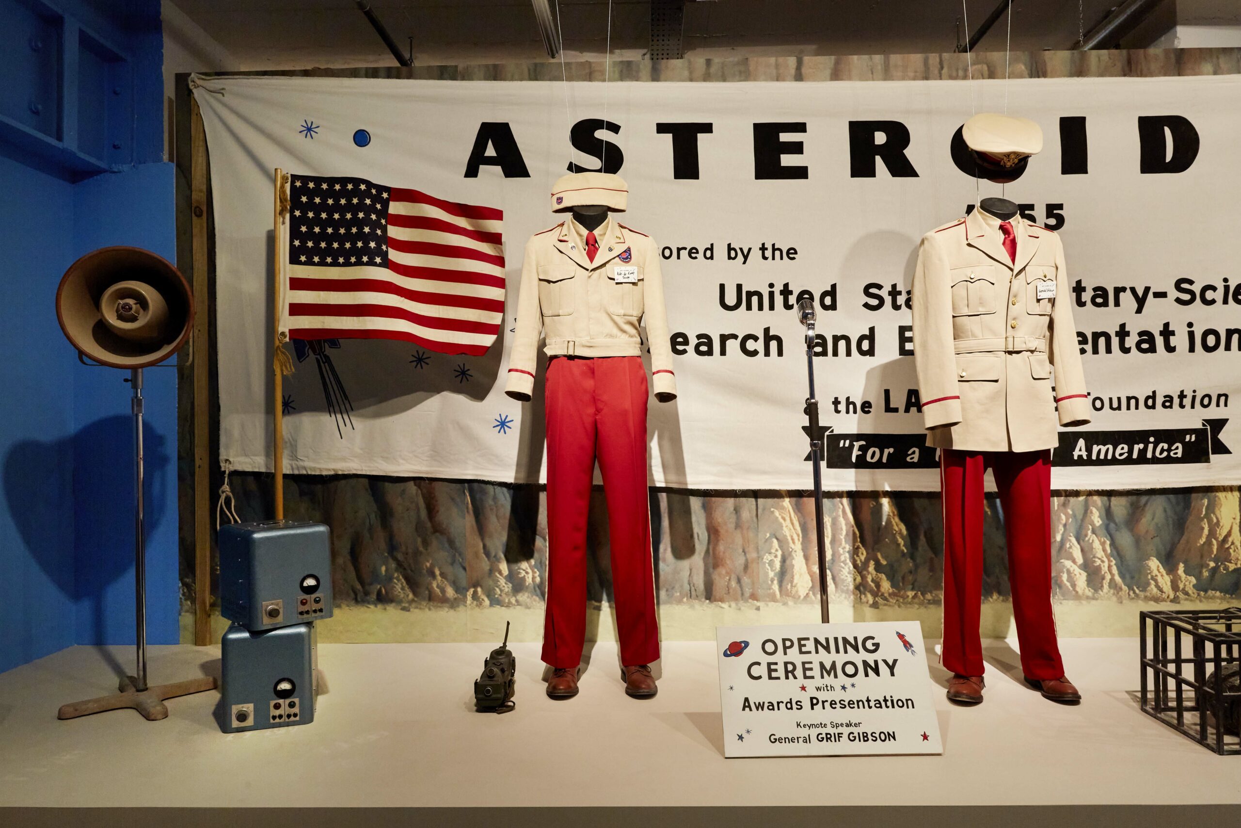
Asteroid Day, Asteroid City Exhibition, 180 Studios, London
Dorn believes that a graphic designer is like a tailor sewing a suit for a client, and there is no reason to emphasize creating a distinct personal style. Her approach is reminiscent of Beatrice Ward’s article “The Crystal Goblet”, in which typography is a wine glass that should not be dominant in containing the liquid itself, but rather give it space. Erica Dorn works in a similar manner. This is a recurring motif in her works, but the perceptive viewer will notice her unique fingerprint and her sensitivity to detail.
Erica Dorn has been designing and illustrating Wes Anderson’s films since ‘Isle of Dogs’, during which she designed all the graphic materials: signs, cookies, dog collars, cards, covers and more. She later on worked on the films “The French Dispatch” and in 2020 on “Asteroid City”. The graphics she designed were presented at three different exhibitions at 180 Studios in London. In 2021 I went to see the exhibition of “The French Dispatch” and it was a powerful experience for me, and a source of inspiration for all subsequent projects I worked on. The exhibition is currently on display until the end of July.
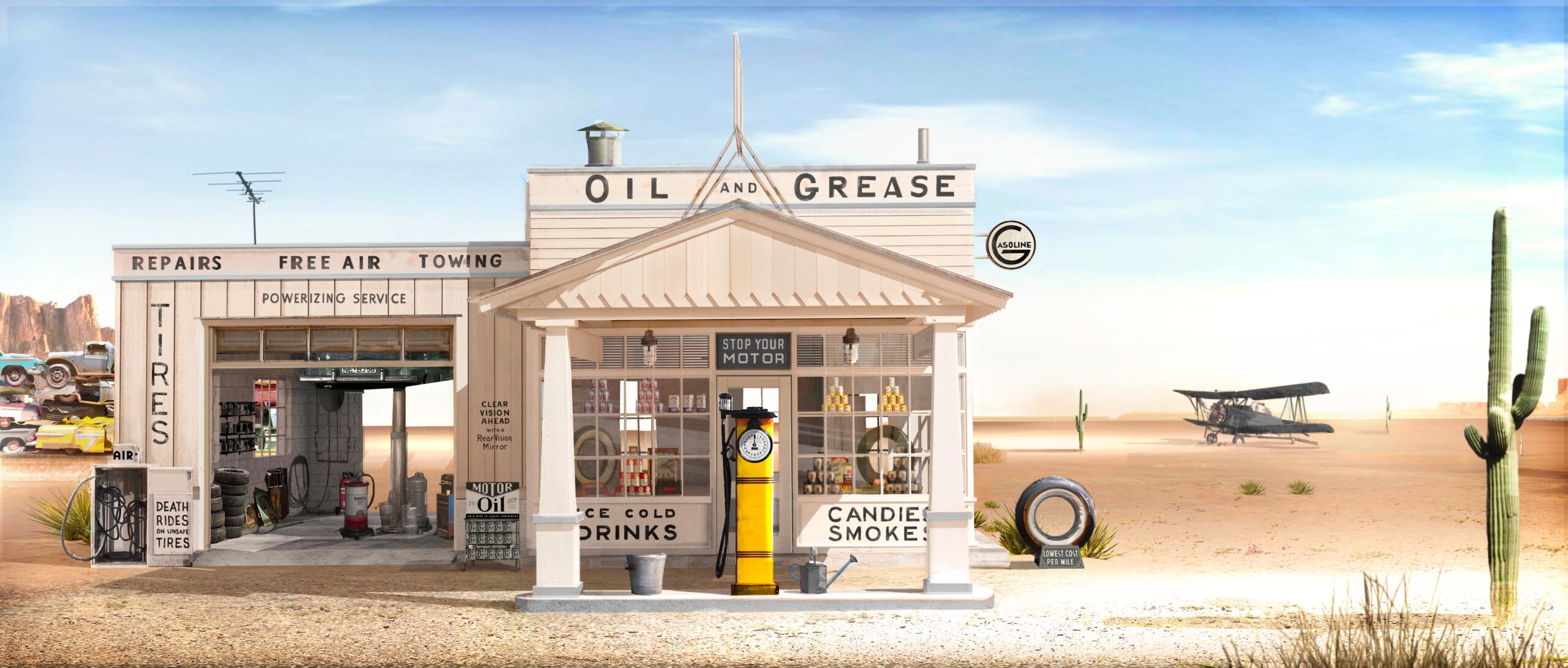
Gas Station Graphics. Courtesy of Erica Dorn/Pop. 87 Productions/Focus Features
Writer/director Wes Anderson's ASTEROID CITY, a Focus Features release. Credit: Courtesy of Pop. 87 Productions/Focus Features
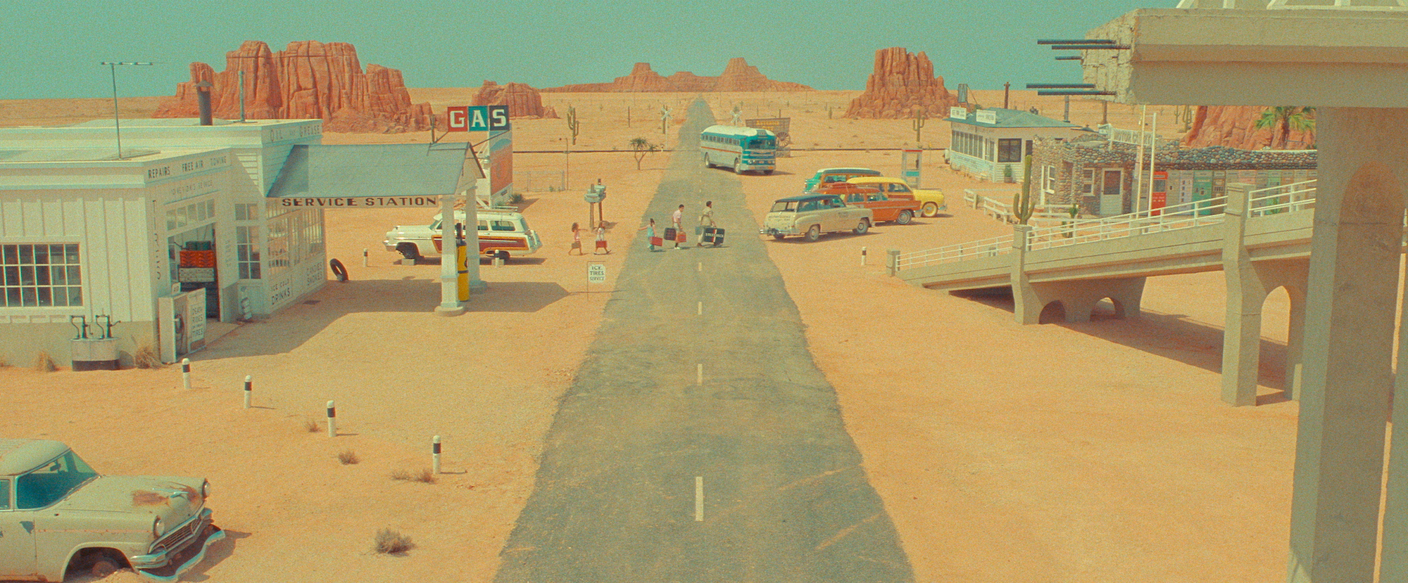
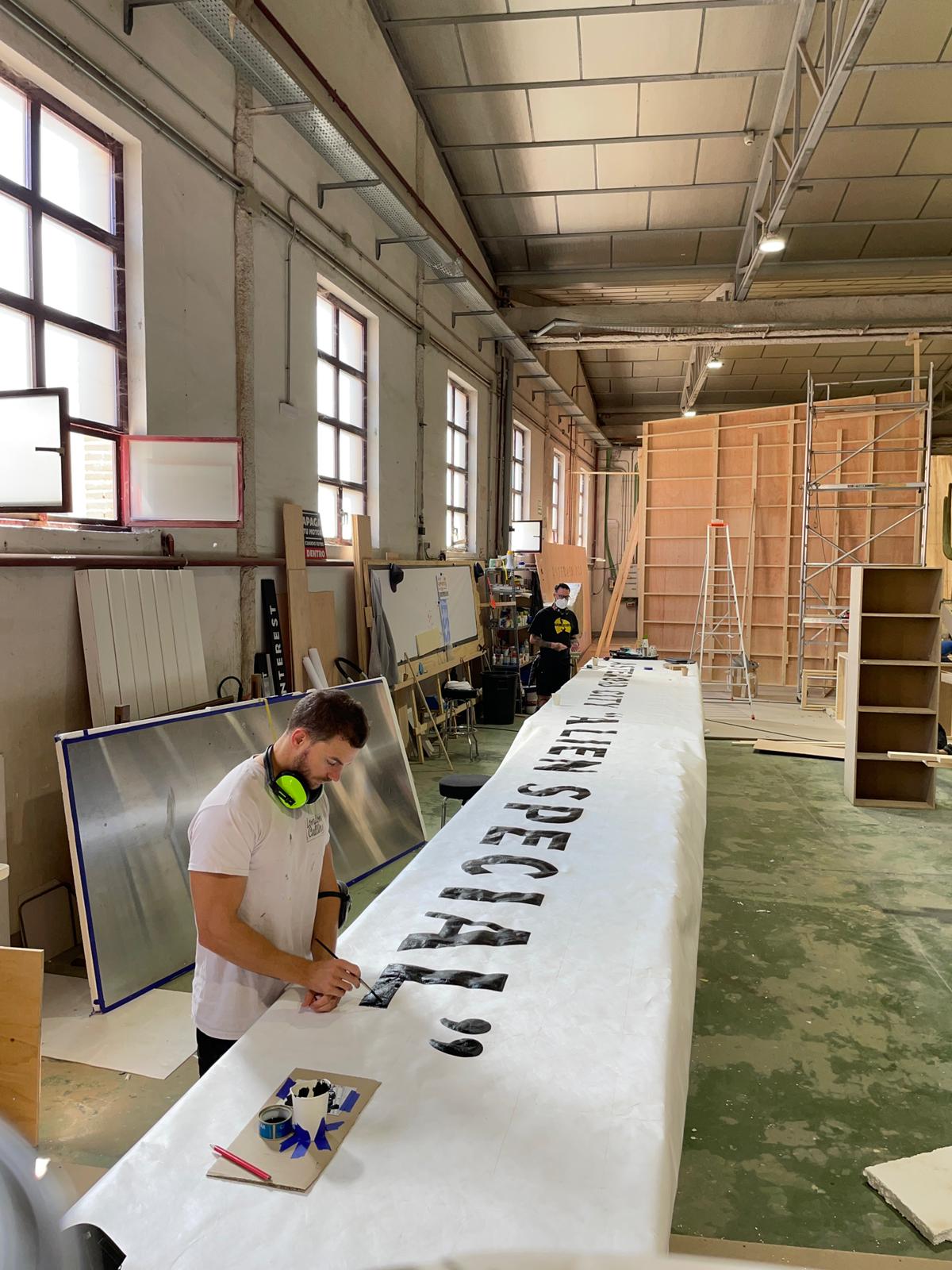
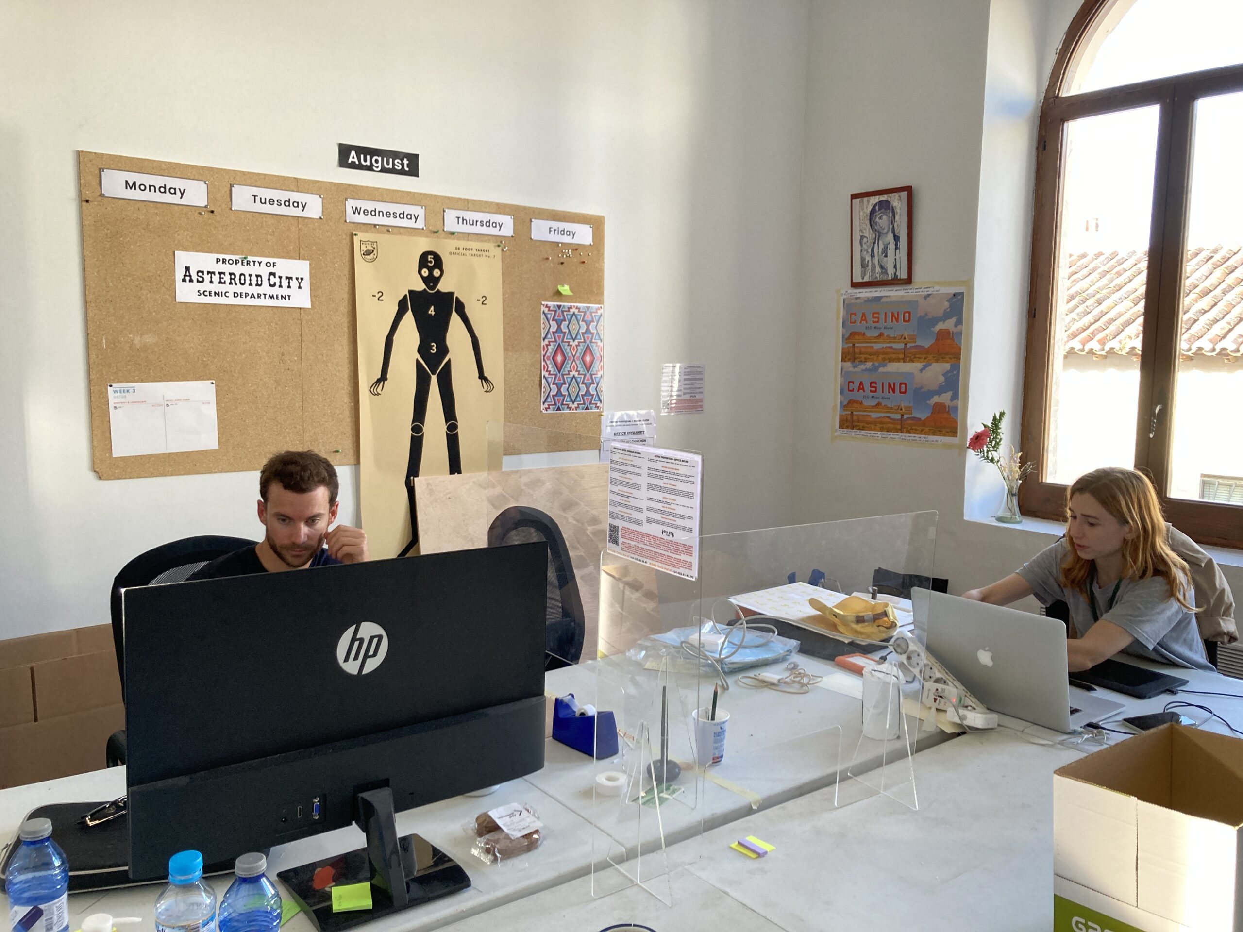
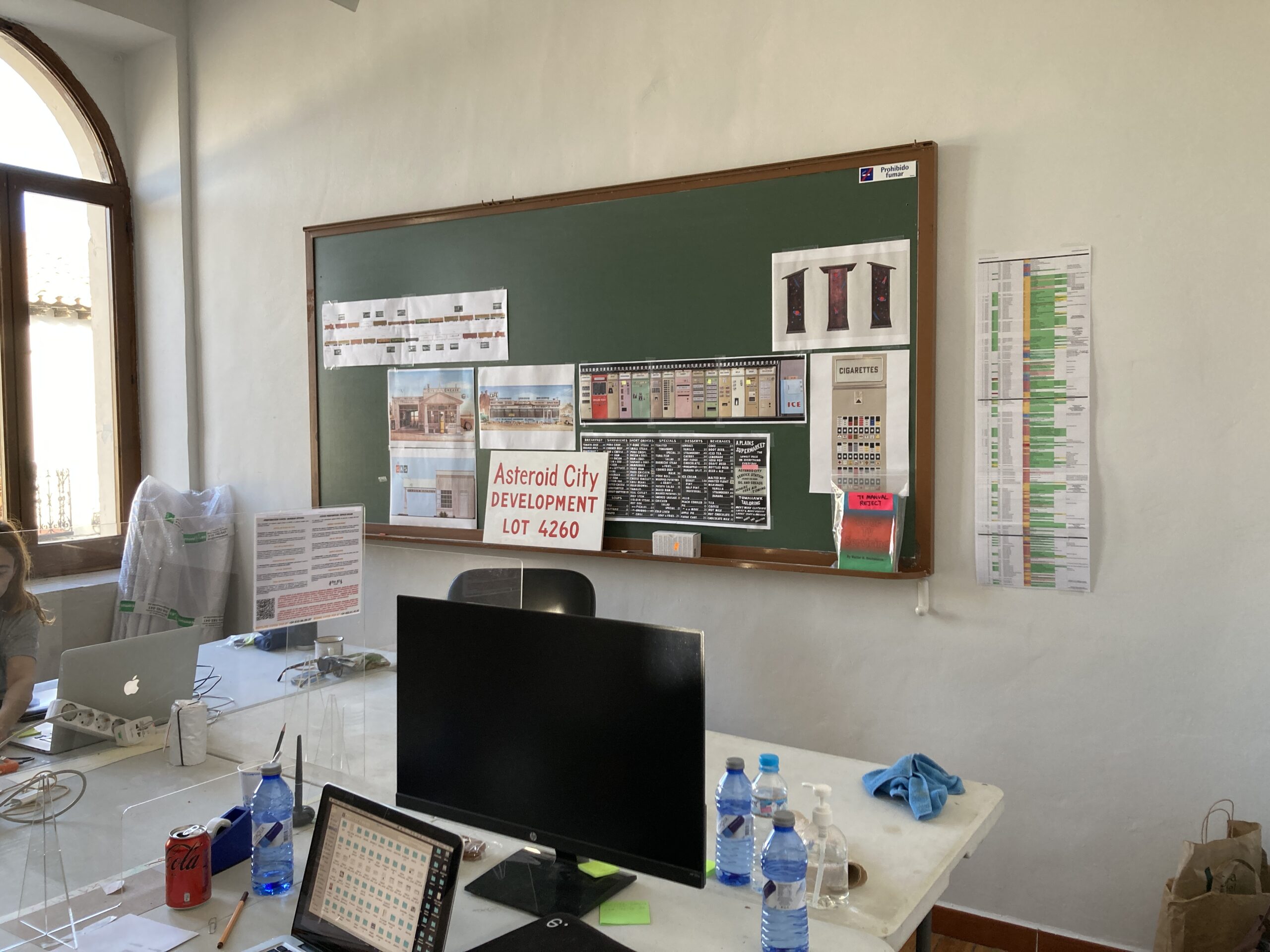
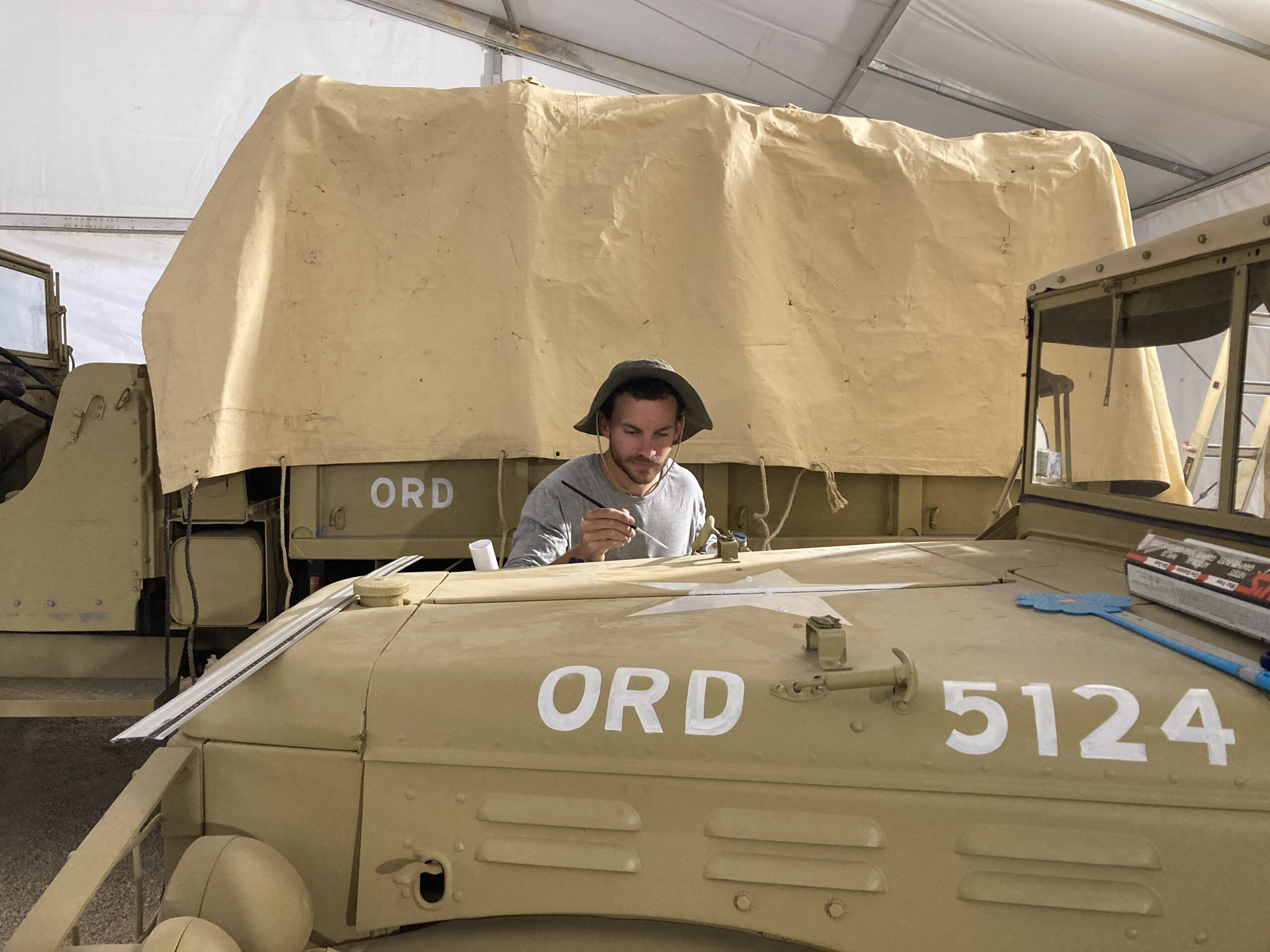
“Asteroid City” was shot on film, at the onset of the Covid pandemic, in Chinchón, a town in southern Spain. The art team, who work with director Wes Anderson regularly, built the entire set on location – from the mountains to the luncheonette and the vending machines, and to the living quarters of the imaginary town’s residents. Everything was built on set, much like a theater set (as can be seen in the film’s opening shot).
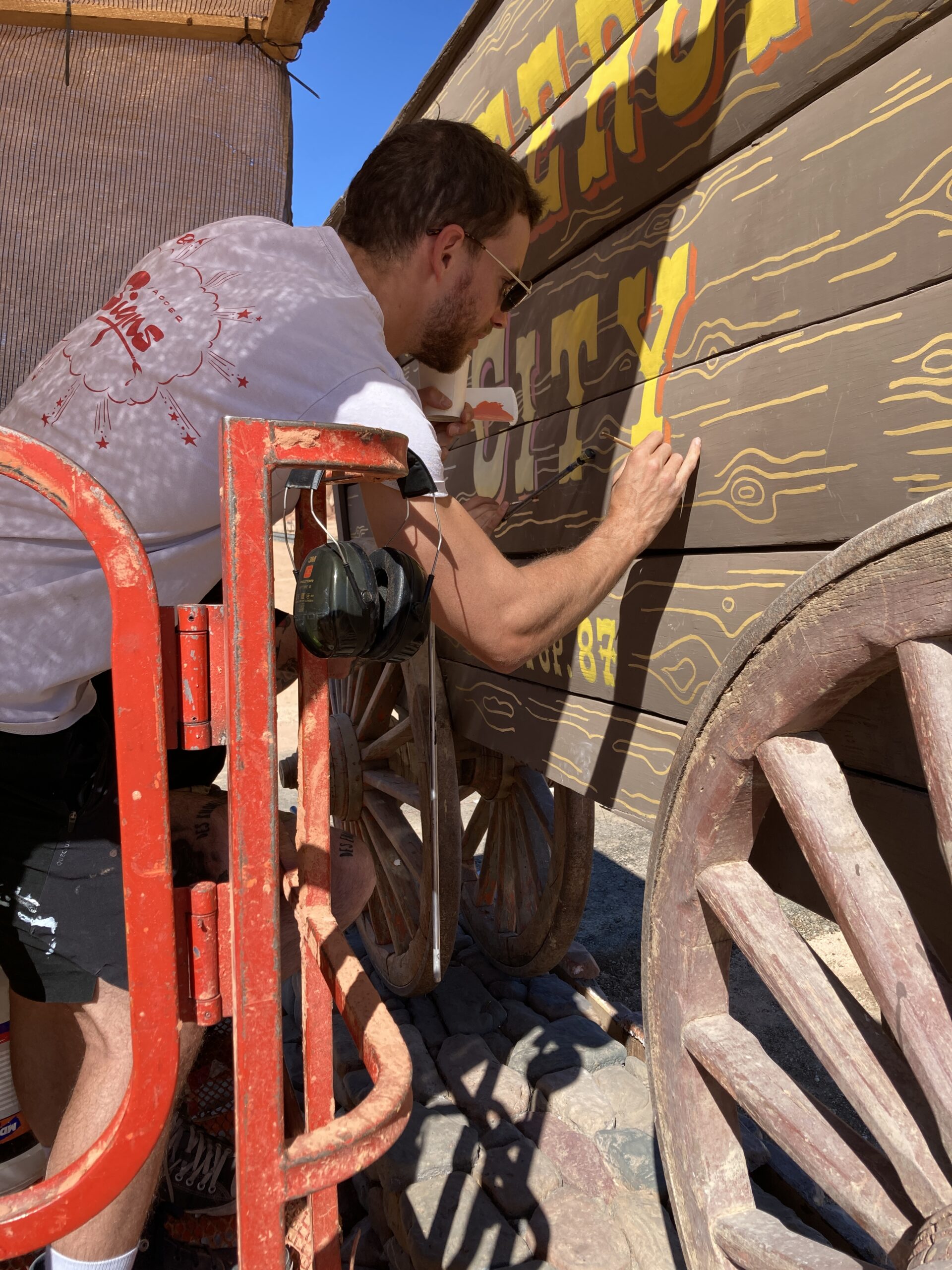
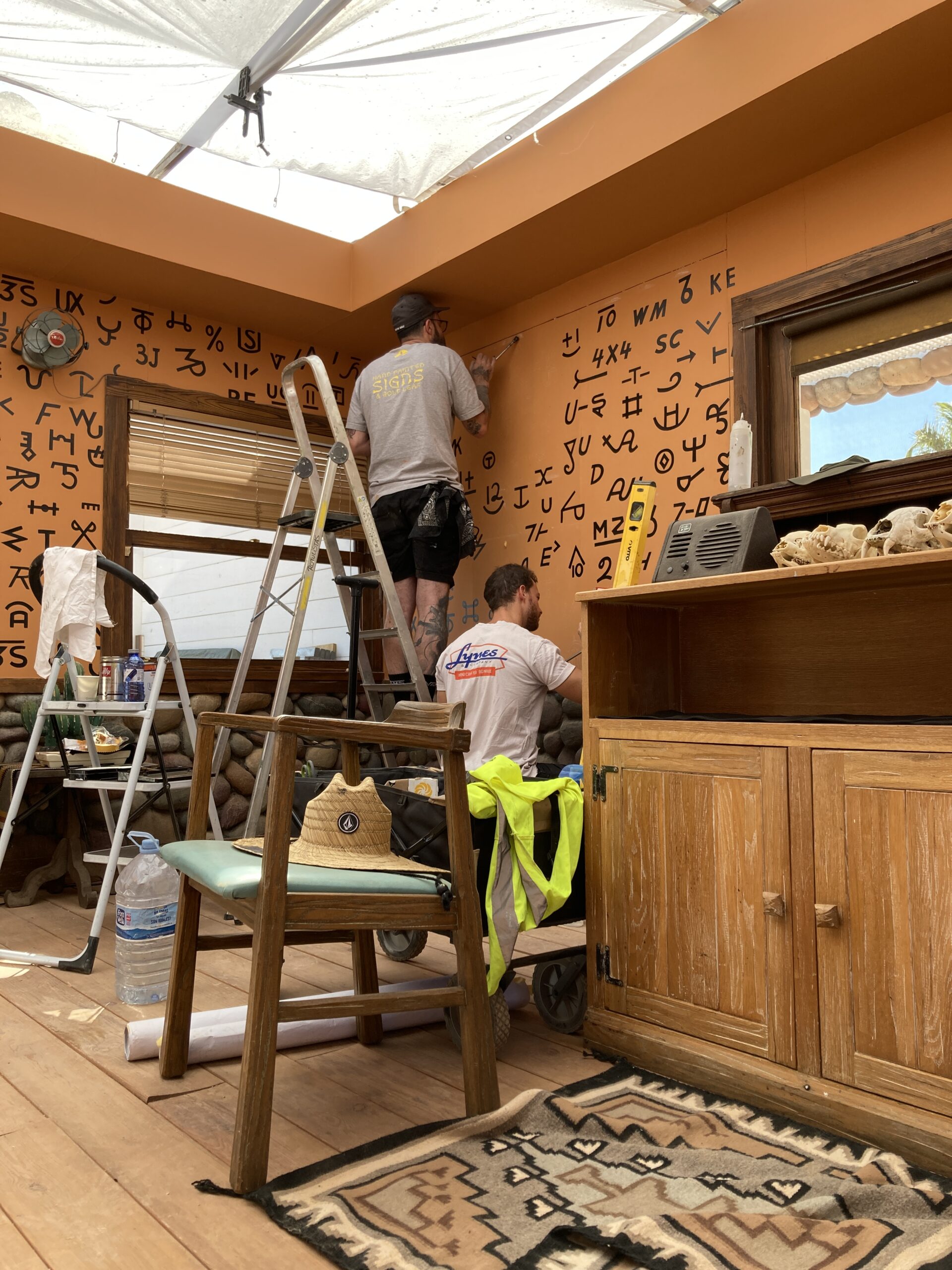
The art department’s studio was set up in a small church, about a ten minute drive from Chinchón. “We had pictures of Jesus and Mary everywhere, along with all our artwork, mixed in with everything else. It was pretty funny,” Dorn says in a Zoom call from London. The church was something of an operation room, where they made all repairs, adjustments and new designs, and almost everything done manually. All of this, while wearing face masks and taking three covid tests per week.
“I started very quietly in the beginning of 2020 and I was doing two or three days a week at first, but I think by April-May we were full time. I had a designer called Lucille who joined me around May as well. We went out there in June-July, so we were there for about a month and a half or two months before shooting started, just to help build everything and print everything and put it up.”
Erica Dorn. Courtesy of Erica Dorn/Pop. 87 Productions/Focus Features
From Storyboard to Complete Design
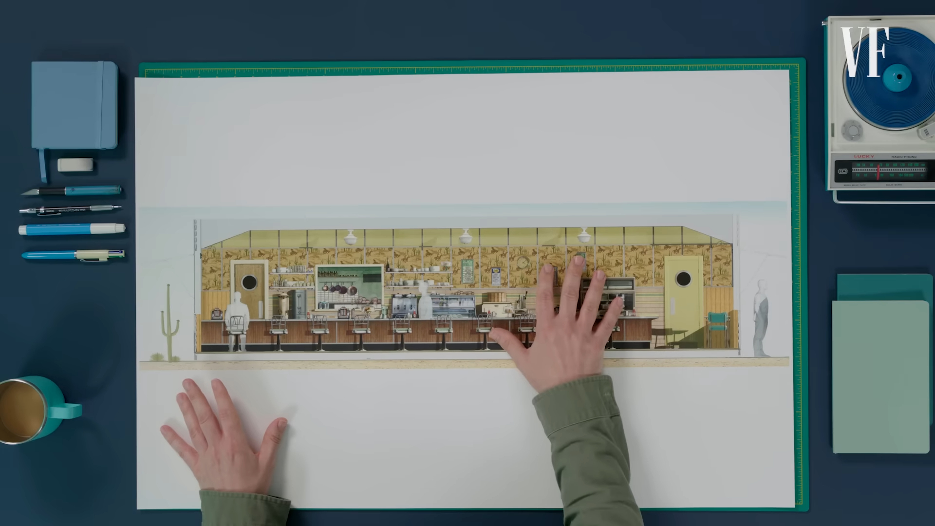
Adam Stockhausen is an esteemed art director who has been accompanying Wes Anderson from the film ‘The Grand Budapest Hotel’ up to the latest one. When working with the director, the art team relies on Anderson and Coppola’s script and the storyboard drawn by Jay Clarke, in which he describes in as many details as possible how the different sets should look in the scenes in the film.
Stockhausen, along with the team, takes the illustrations from the storyboard and goes into the smallest details, as seen in the following Vanity Fair video. At this point Erica Dorn, the designer, comes into play, as she marks on the storyboard all graphical elements that need to be designed for the film.
Mockup Menu. Courtesy of Erica Dorn/Pop. 87 Productions/Focus Features
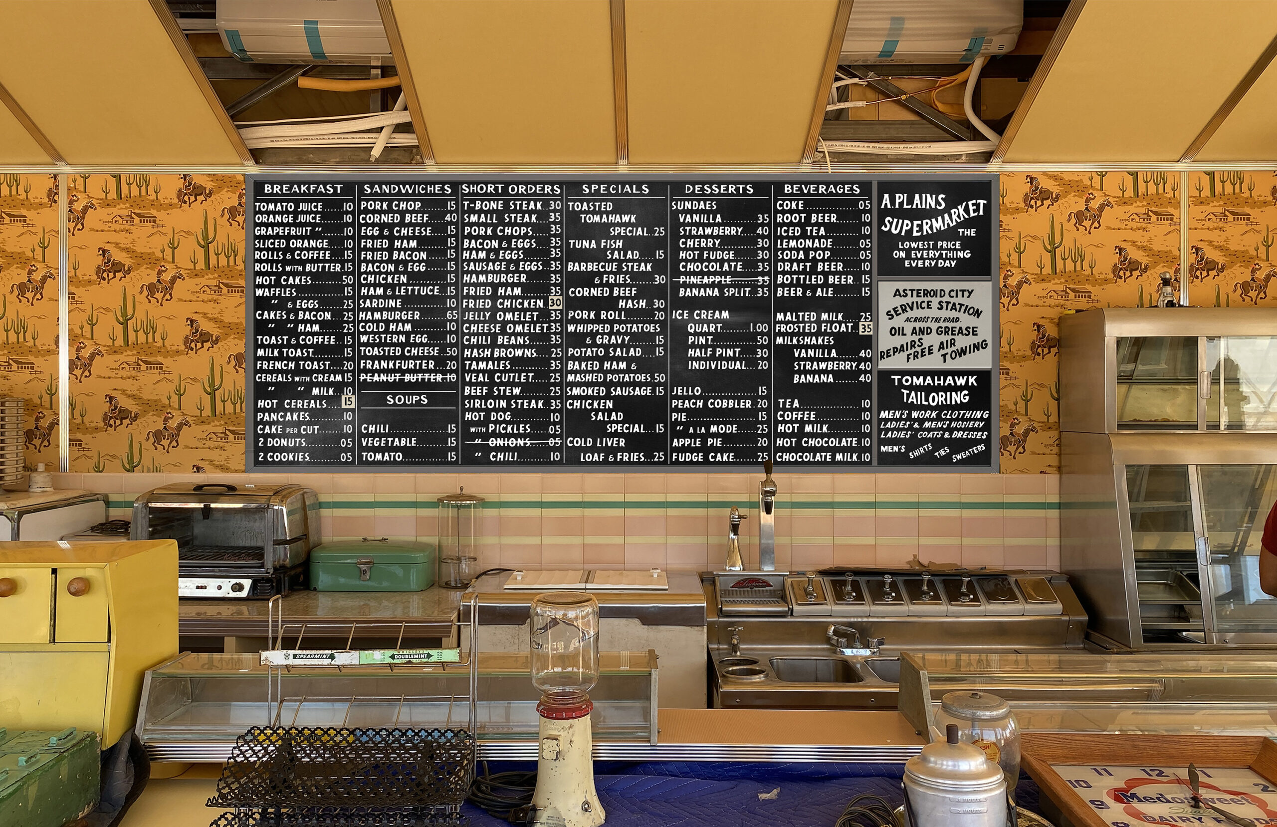
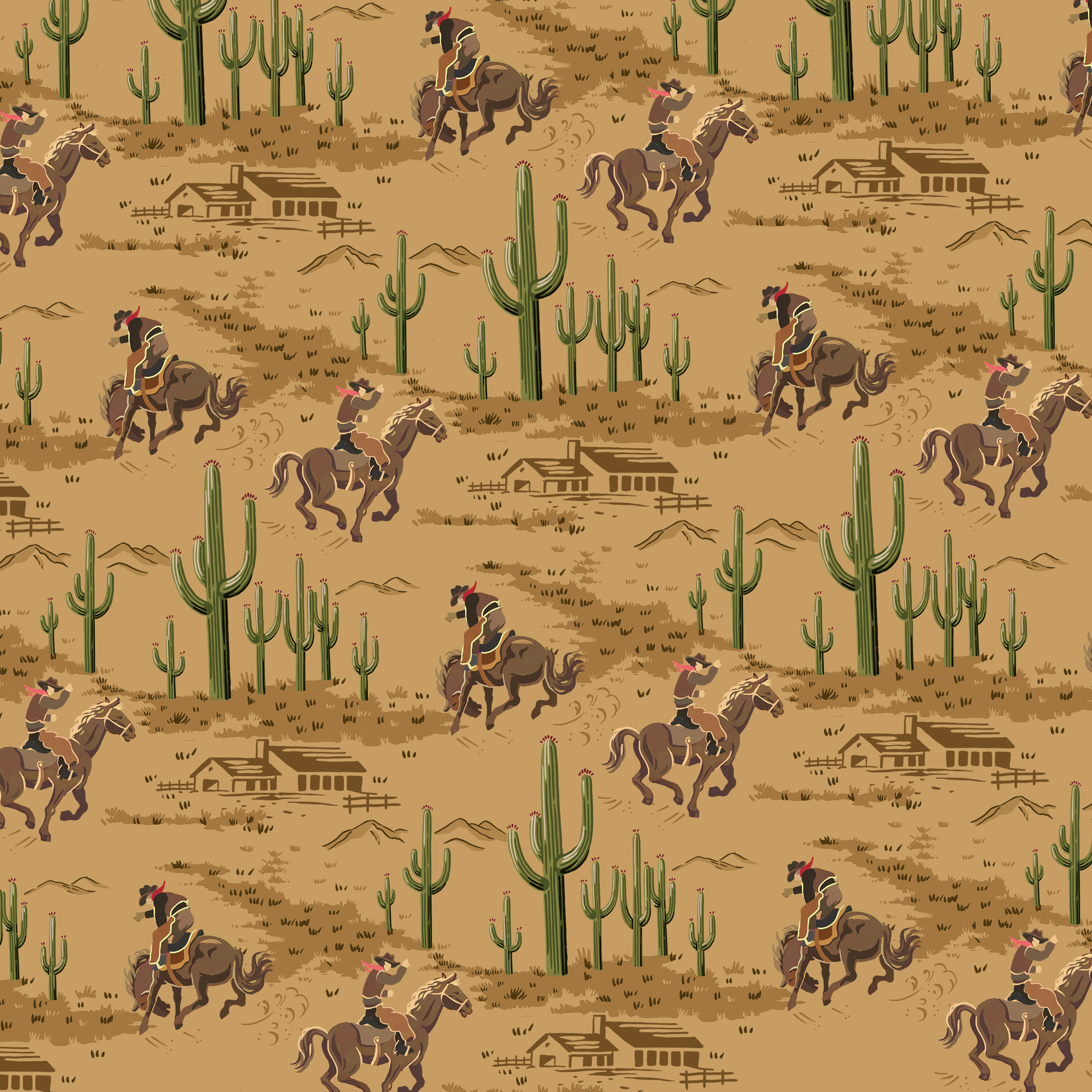
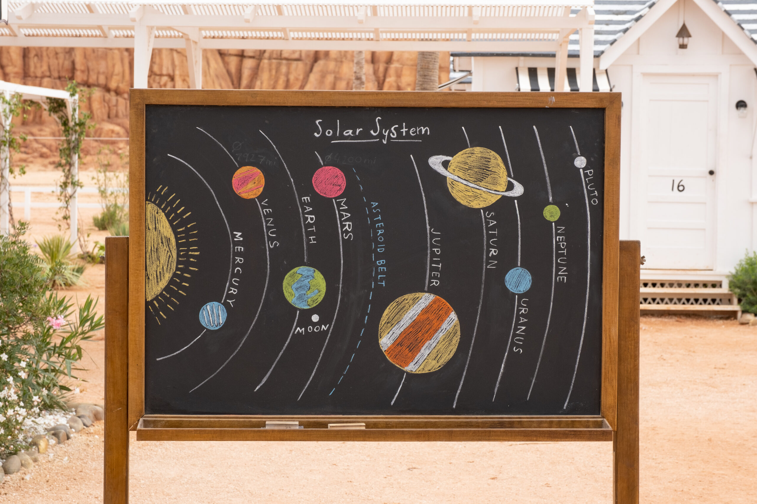
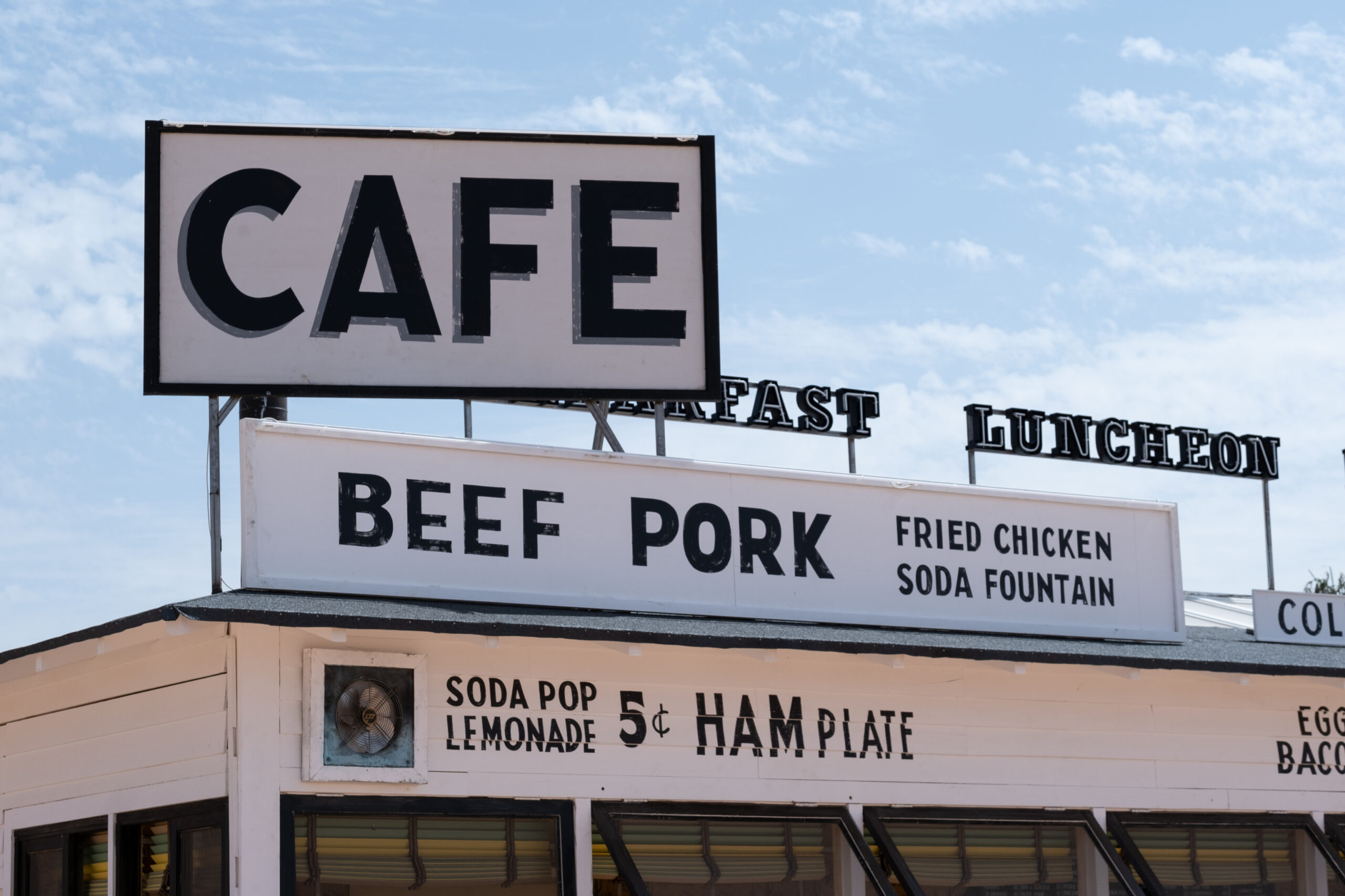
“Most of the work is for the sets and props. I’m sure you noticed when you were watching it, there are just words everywhere on the luncheonette,” says Dorn. “That was kind of a terming detail that we saw in a lot of references, where they just write what they have on the menu on the outside of the building. And all the little signs, labels on the suitcases, labels on the Tupperware, the signage with the “welcome stargazers”, the motel signage with the “no vacancy” signs, the one that says “motor court”. Basically everything that is words that you see. We also worked on things like wallpaper, like the cowboy wallpaper that you see in the luncheonette. We made an original one for that, based on some old 50’s wallpaper that the set decorator found and bought. We sort of scanned it and made our own inspired by that, tweaked the colors a little bit”.
Vanity Fair
Courtesy of Erica Dorn/Pop. 87 Productions/Focus Features
Courtesy of Erica Dorn/Pop. 87 Productions/Focus Features
Asteroid City. Courtesy of Erica Dorn/Pop. 87 Productions/Focus Features
Courtesy of Roger Do Minh/Pop. 87 Productions/Focus Features
Which kind of typography research did you do in the pre-production?
“We mostly looked at old photographs to be inspired and old archive images of products. Almost everything that we do comes from historical archives, we never really make anything up from thin air. A lot of it comes from there, and we have an amazing researcher called Emily, who works with us. Her whole job is finding images for us to refer to. So, yeah, a lot of historical stuff from 50’s and 60’s in the American West.”
Another source of inspiration is films by Wim Wenders. “We looked at a lot of films. There’s one called “Bad Day at Black Rock” which was the inspiration for kind of the layout of the town and also the opening, the title sequence with the train running through. Films like “Ace in the Hole” which kind of inspired the whole carnival scene where all the tourists walk up to celebrate the events. Lots of these little things”
Which kind of fonts did you use in this film?
“Actually, we didn’t use a lot of fonts. A lot of it is hand-drawn lettering. Even the opening titles are a font that we made from handmade lettering. So that opening sequence from “Bad Day at Black Rock” that I told you about traced the letters from there, and then we created a font and added a drop shadow and this sort of 50’s effect.”
She adds: “the signage on the outside of the sets of Asteroid City, most of them were hand-rawn fonts based on looking at references. We have sign writers on set who paint everything by hand. The problem with fonts is that people in 1955 would not have used the font on the outside of a building like that. Technology didn’t exist to translatepainted lettering, it was never really based on fonts, it was based on styles that signwriters copied. We wanted to follow the same process in order to get that authenticity, so we very rarely use fonts for things that wouldn’t have been done with fonts. We use them to kind of support us and to guide us, but we try to stay away from digital fonts in general for periods.”
Courtesy of Erica Dorn/Pop. 87 Productions/Focus Features
Mockup Menu. Courtesy of Erica Dorn/Pop. 87 Productions/Focus Features
How do you start working on all the typography? Did you see the storyboard first?
“Yeah, there’s several stages. There’s a storyboard. There’s also a lot of concept art, and for the luncheonette, for example, a lot of it was already in the concept art, so it was a matter of sort of refining it and cleaning it up and giving it an actual style rather than just a scribbly style.
For props, it’s a little different because you don’t really concept props. That mostly comes from references. Augie’s suitcases, for example, are quite characterful. Not stencils, but, like writing his name, the Steenbeck on his suitcases, those came from actual photographs of old suitcases that we found in the archive.
Mostly we’re just inspired by real things that we find, and that our researcher finds for us in archives. So if it’s a suitcase, we look at 50 different photos of suitcases, and if it’s wallpaper, we look at 100 different wallpapers. And if it’s a menu, like, for the luncheonette, that big blackboard with all of the text on it. That’s inspired by a real photograph of a real diner in the 1950s. So everything comes from somewhere, and we just adapt it and make it fit our film”.
Courtesy of Roger Do Minh/Pop. 87 Productions/Focus Features
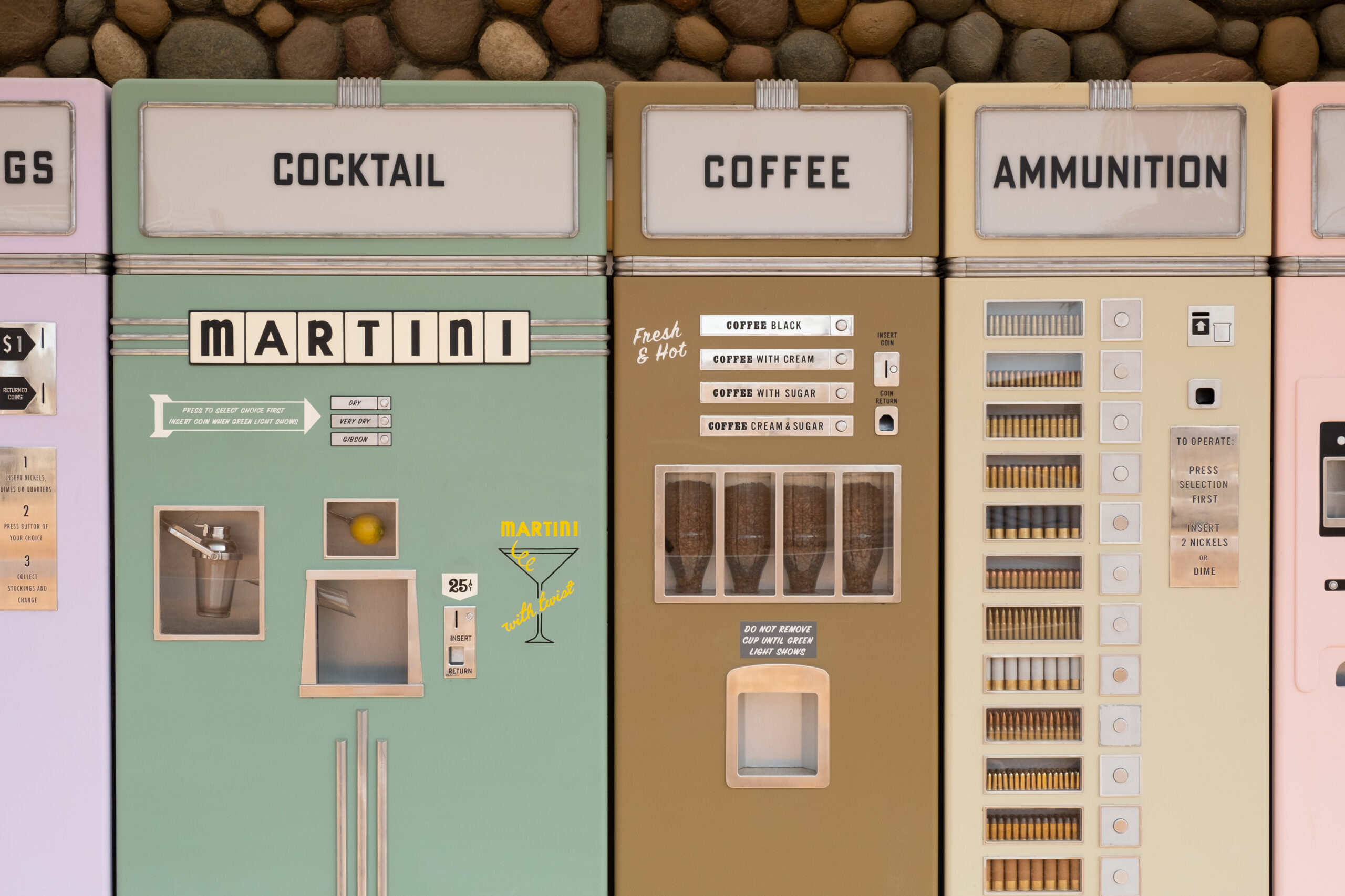
Did you design the martini machine?
“Yeah — not the mechanics of it, but the little sticker that says “martini with a twist”. It’s very Miami, isn’t it?”
Yeah. I would like to drink one! Absolutely. The vending machines were also really funny, especially the one selling real-estate.
“Yeah. Also from a reference, but a slightly later reference. I think we cheated a little bit with the timing on that because I think that kind of quantity and variety of vending machines were mostly just in big cities where they could afford it in big department stores, they never would have had it in my tiny little motel like that. But it’s an idea.
And the real-estate is a funny one. We had an artist called Kimberly Pope doing those landscapes, the little postcards, and she painted each individual one by hand. We reprinted it, and the signs in the postcards were actually added when we were making the postcards. And then later he decided, oh, we should actually put them in the land as well.
So it started with the postcards, and then we made the real ones as a sort of an afterthought, almost, where we just cut some boards and gave it to the sign writers, and they copied what was on the postcards where it says “development lot 6854”, or whatever. And that was also from a reference, I think it was a Wim Wenders photograph that had this really great old and dilapidated sign.
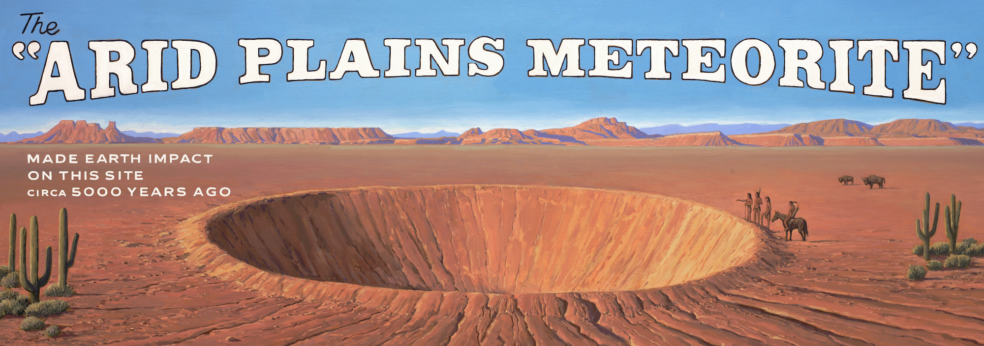
David Meikle, who did the painting on the billboards, did the poster for the film as well. But he worked more directly with Wes. I worked with him to add the typography on top where it says “Arid Planes”, then we printed those, he did those paintings in the States, photographed them, sent them over, and we printed them in actual size on paper, and had scenic painters paint over them. So that’s how we printed something so big and still made it look sort of hand-painted.”
Courtesy of Roger Do Minh/Pop. 87 Productions/Focus Features
Courtesy of Roger Do Minh/Pop. 87 Productions/Focus Features
Asteroid City. Courtesy of Erica Dorn/Pop. 87 Productions/Focus Features
Erica Dorn worked with a large team: the graphic designer Lucile Gauvain, who also worked on “The French Dispatch”, Anderson’s previous film, Celia Casterá, a local graphic assistant and Nina Felís. Alongside the two sign writers, Vincent Audoin and François Morel, who also took part in his previous film. “A lot of the crew is French, I think it happened because Wes Anderson wanted to keep most of his crew from the previous film,” says Dorn.
Anderson is known for his fondness of working with a similar cast from film to film, with minor adjustments. For example, the main actor who plays Auggie, Jason Schwartzman, starred in his breakout film “Rushmore” and in several of Anderson’s other films. Most of the actors in the film took part in his previous films.
I cautiously asked Erica Dorn what she was working on these days. Although she can’t disclose any details, it looks like it’s Wes Anderson’s next film. In the meantime, we can only imagine.
Thanks to Universal Studios and Tulip for facilitating this interview, and to Amit Tsafrir for editing it.
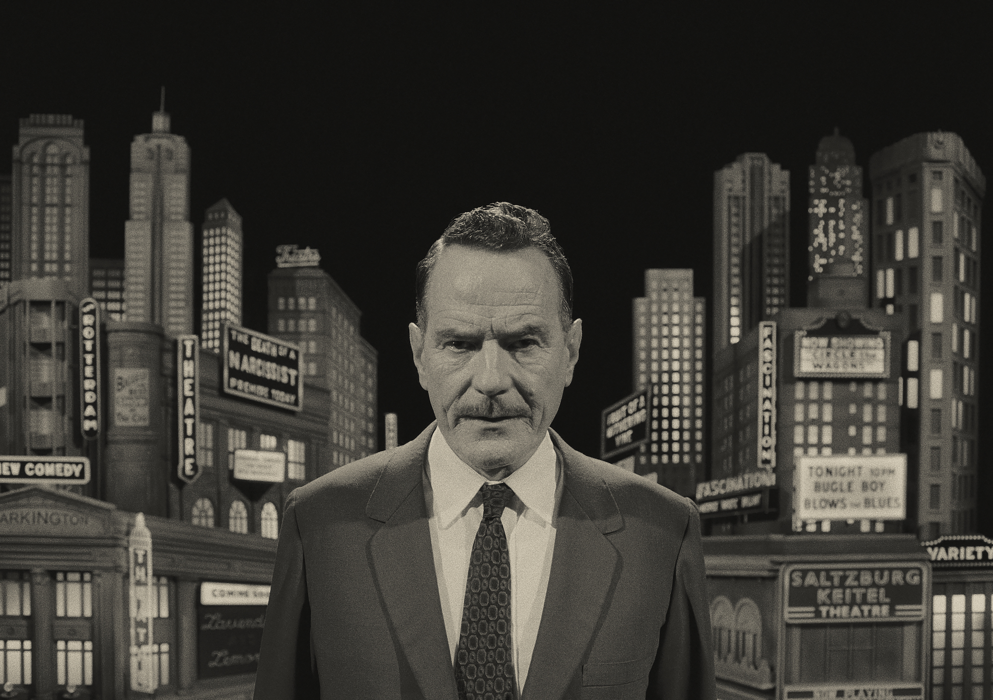
Bryan Cranston stars as "Host" in writer/director Wes Anderson's ASTEROID CITY, a Focus Features release. Credit: Courtesy of Pop. 87 Productions/Focus Features
ווהו! נרשמת לניוזלטר שלנו בהצלחה!
המלצה: קבוצת הפייסבוק שלנו Secret Uncoated כוללת יופי של ממתקים המתעדכנים על בסיס יומי, עם מלא אנשים טובים ←
