Discover the most beautiful, unique, and creative English fonts from top type foundries. A curated guide that keeps growing.
OH no Type
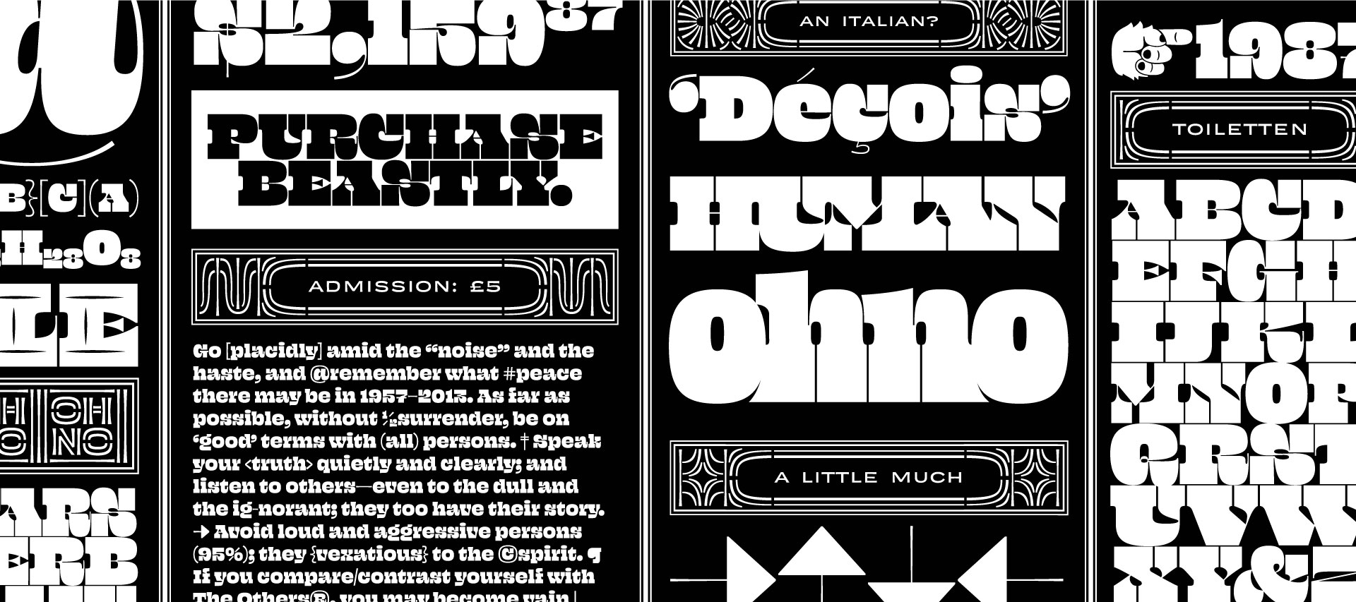
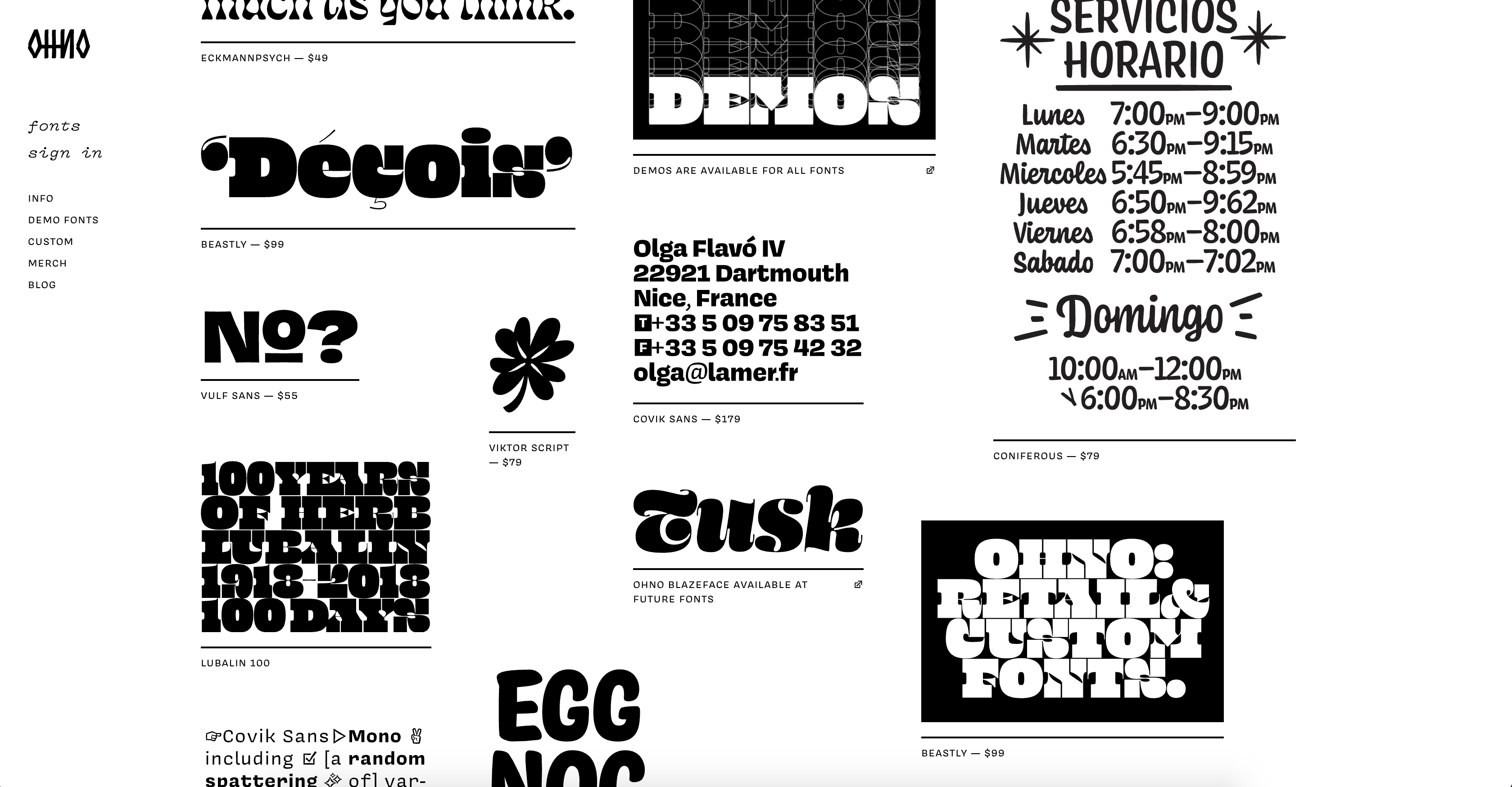
The type designer James Edmondson started his career in 2014, after graduating from the Royal Academy of Art in Hague, he released his three initial fonts as a freelancer, without having any previous experience in a type foundry. As time passed, he realized there are more of commercial fonts, as well as more of experimental ones, and there should be a mixture of the two in order to make it in the business. His fonts are incredible for headlines, films and posters, along with “fancier” fonts for product design.
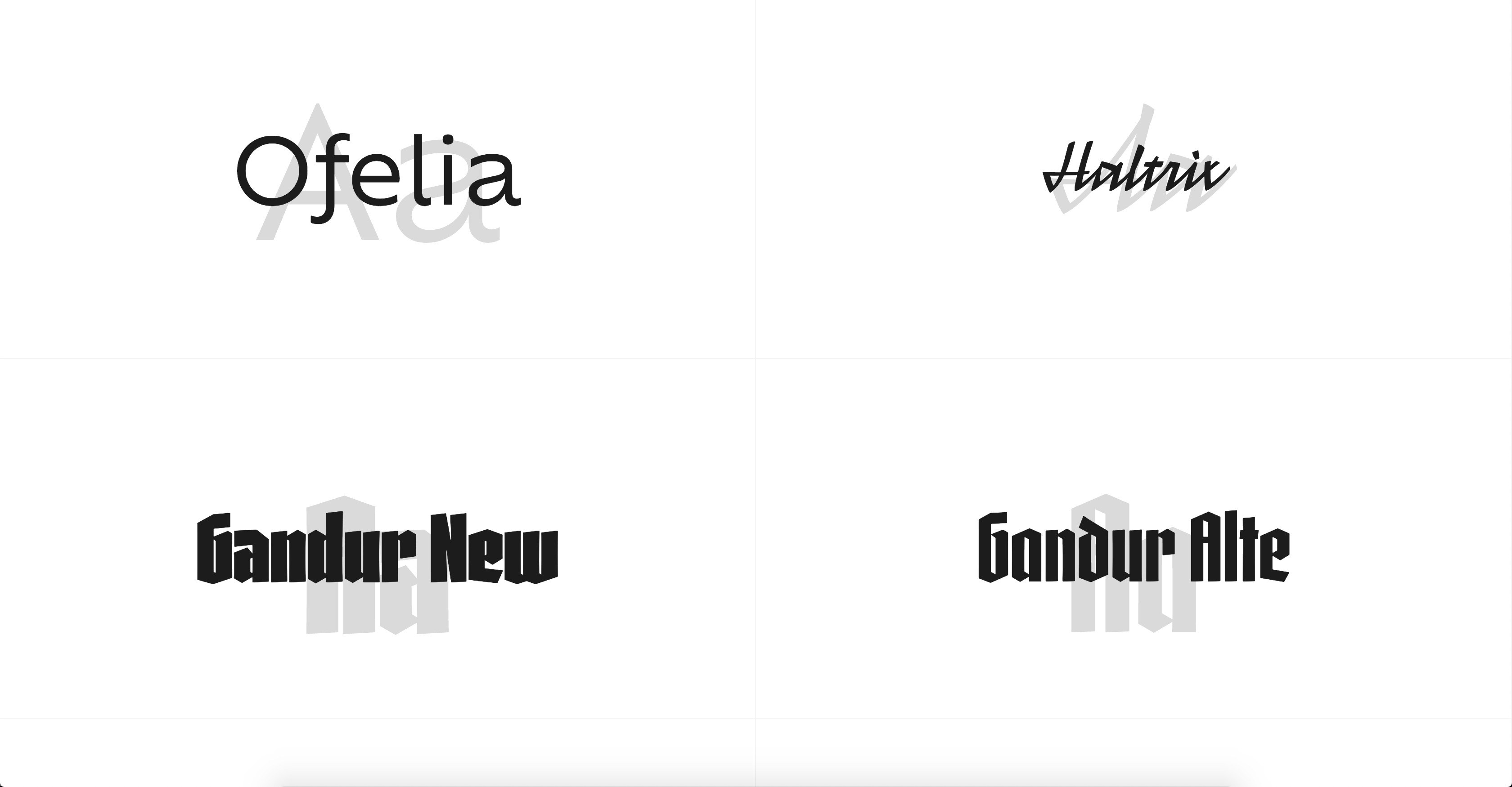
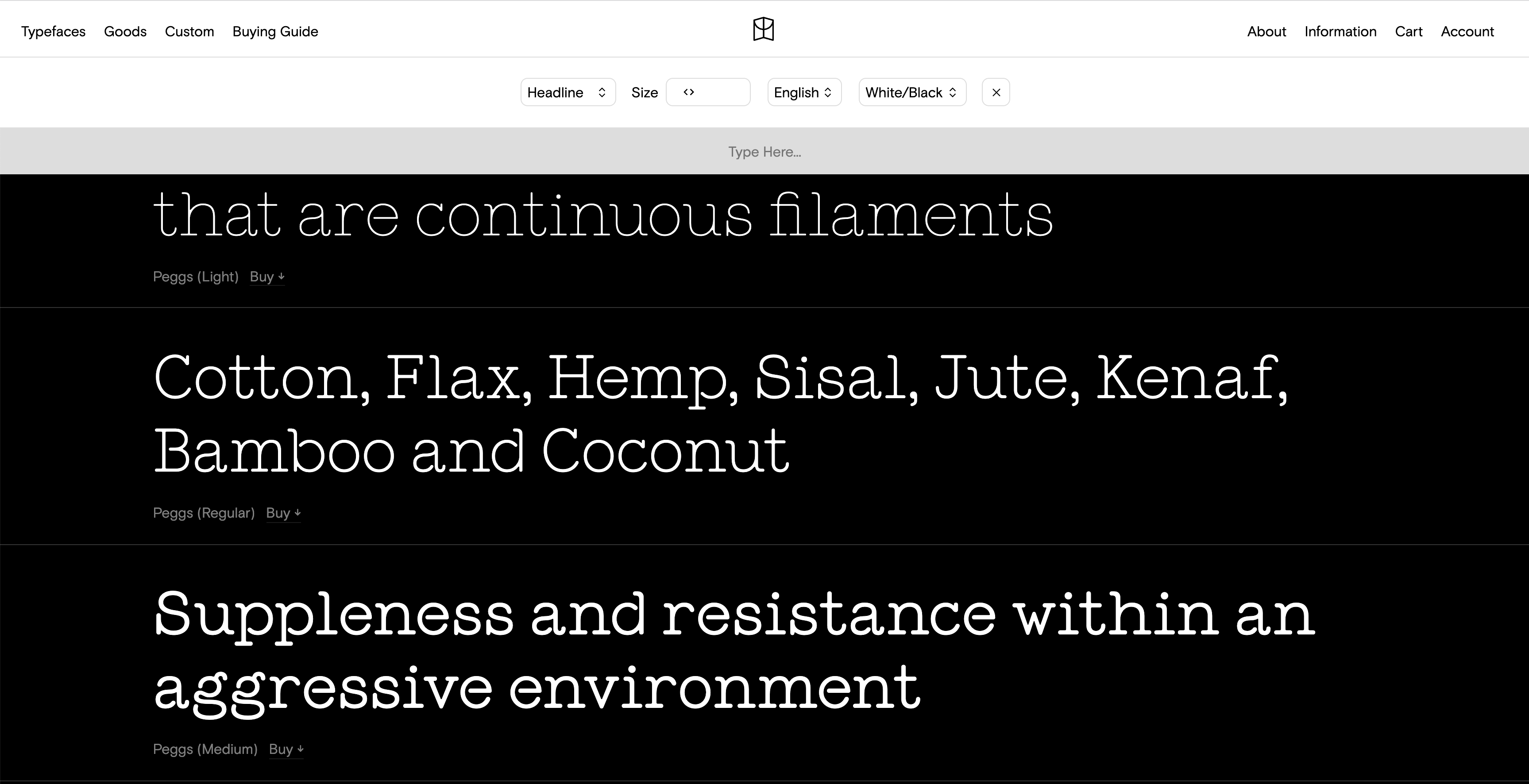
Type foundry that was established by the Brazilian type designer Daniel Sabino, currently located in Sao Paulo. He started designing fonts in 2012. He has relatively a small collection of fonts but they are very fine for headlines, and the most fun thing about his license is the option to use his designs in prints, as well as using them in a website (until a certain amount of entries). I got the sexy goth font ‘Gandur New’ to brand my portfolio and I’m very happy with it!
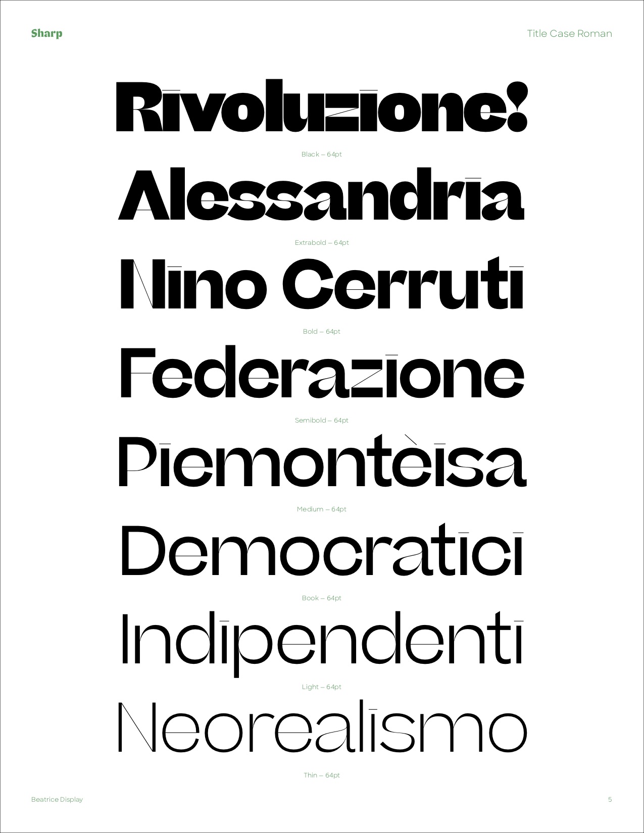
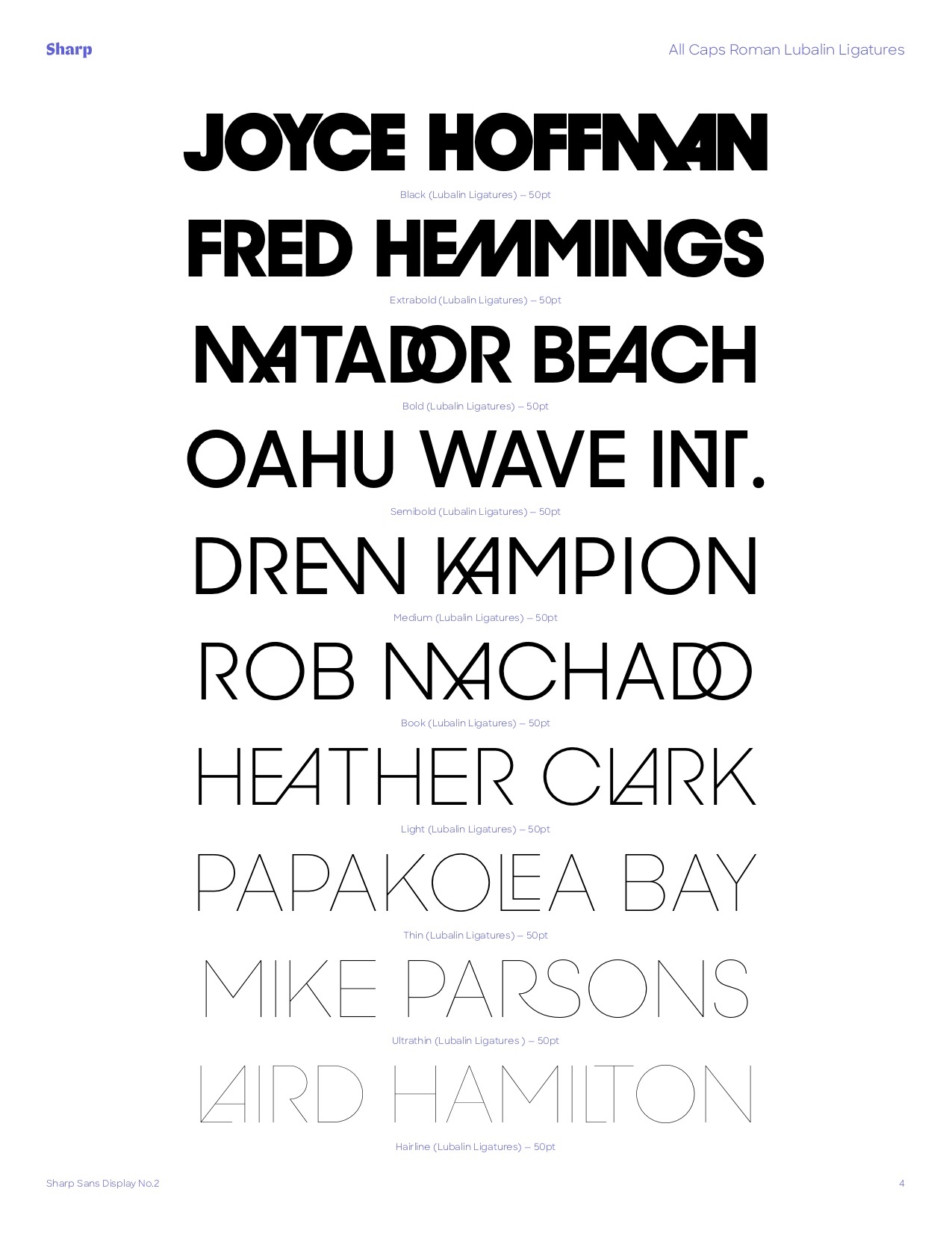
This amazing studio, located in NYC, was established by Lucas Sharp and Chantra Malee. There are two additional designers working with them, and their fonts are on the spectrum, from experimental designs to more formal fonts for corporations such as Samsung, Dropbox, BBC, Virgin and more. They are especially great for digital products and running text.
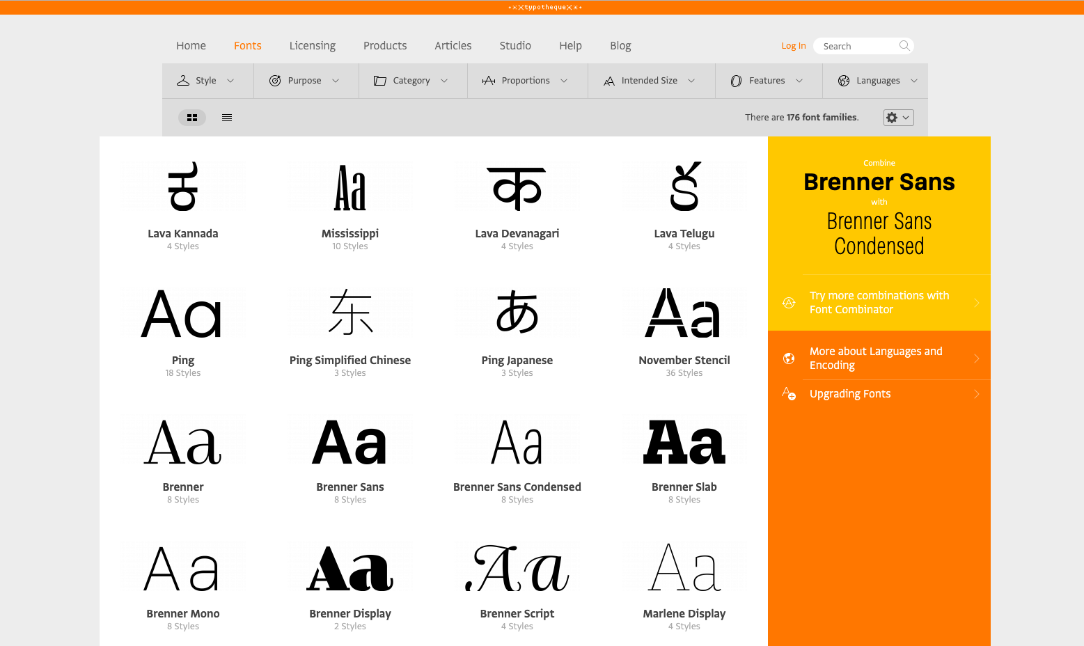
The studio was established by Peter Biľak, Johanna Biľak and Nikola Djurek in Hague, in the Netherlands. Their focus is type design, and they were among the webfonts pioneers in 2009.
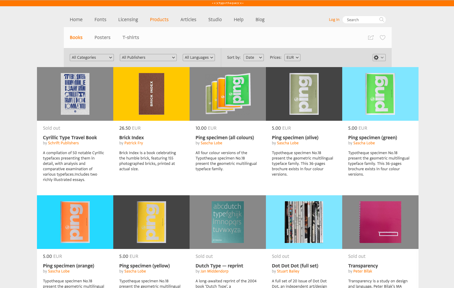
They work as publishers and print designers, and together with their on-point fonts, they offer dandy merchandise at a very accessible price. There are tons of font specimens for just a few Euros, and books related to their typographic realm.
In addition, the studio is collaborating with typographics from around the world, and you would be able to find some Hebrew fonts among them, such as ‘Pedra’ and ‘Greta’ in collaboration with Michal Sahar; ‘Ping’, ‘Ziko’ ‘October and ‘November’ with Daniel Grumer, ‘Parmigiano’ with Yanek Iontef and more.
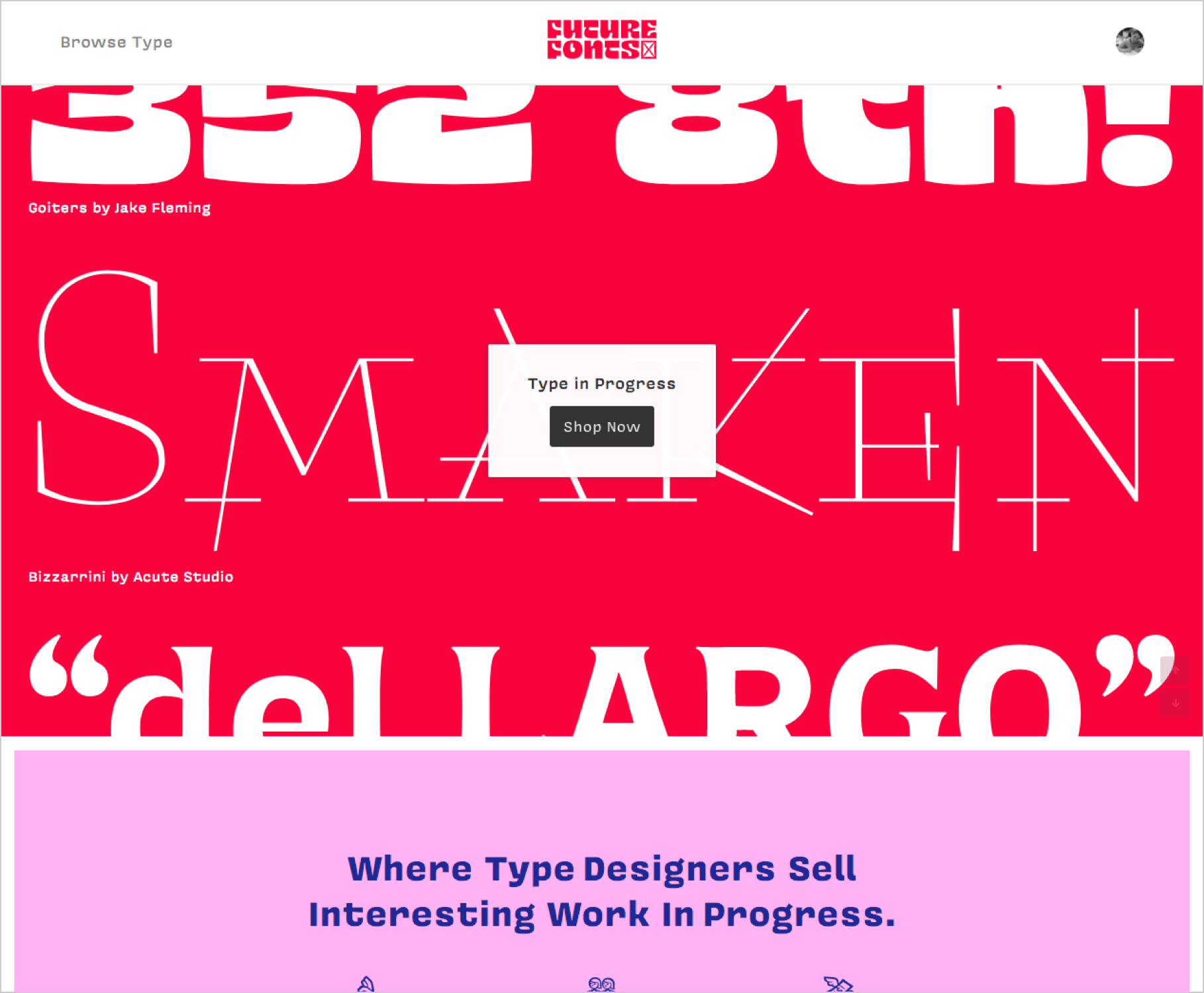
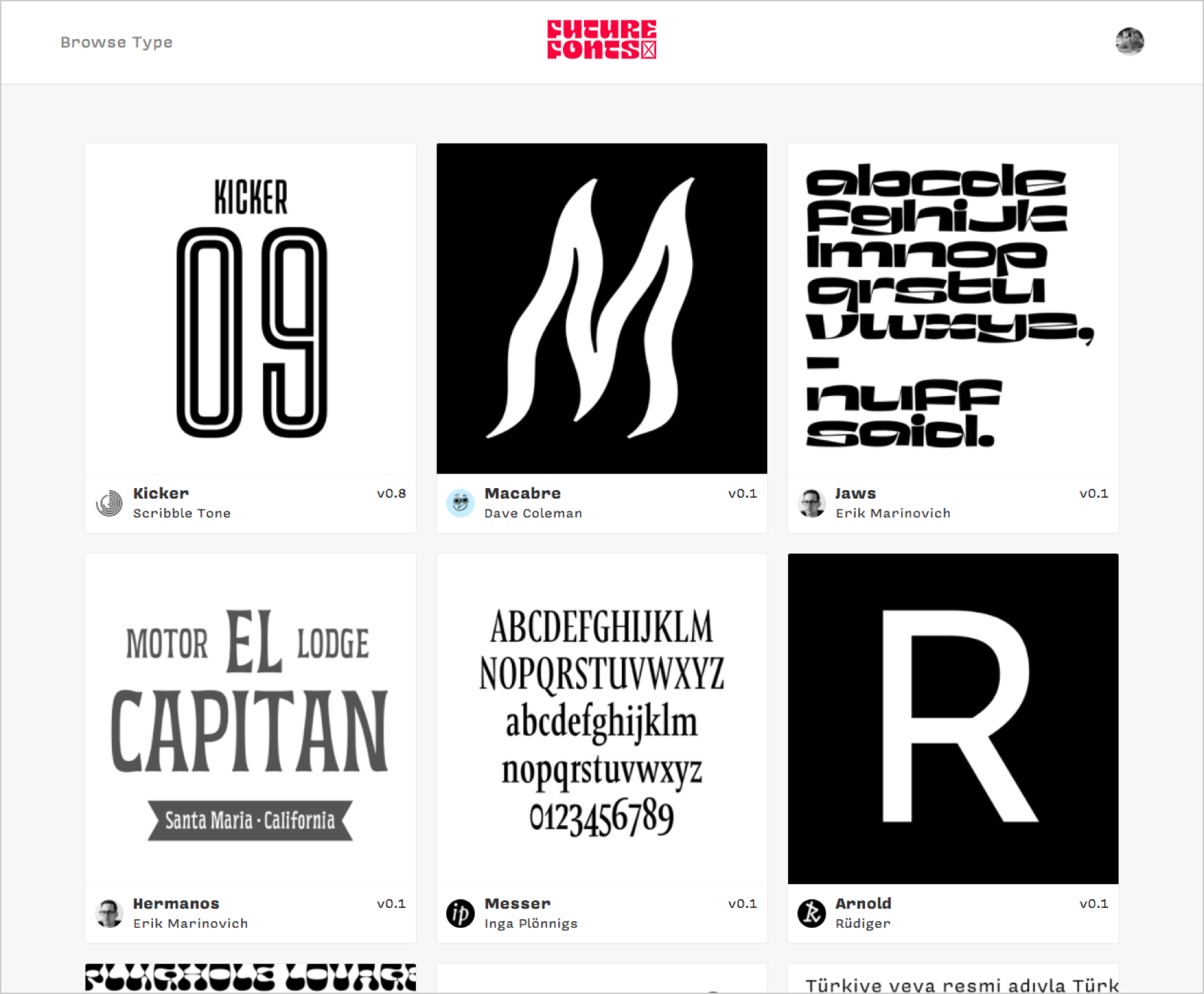
Future Fonts is the marketplace for independent and experimental fonts, which was established by Lizy Gershonzon and Travis Kochel (Scribble Tone), and James Edmonson (OH no Type Co), with the aim to broaden the exposure to different English type designers – the weird and the unique. This is a collection of dozens of designers, with no distinct conceptual link between them, that gathered together to form this platform. Definitely worth checking them out.
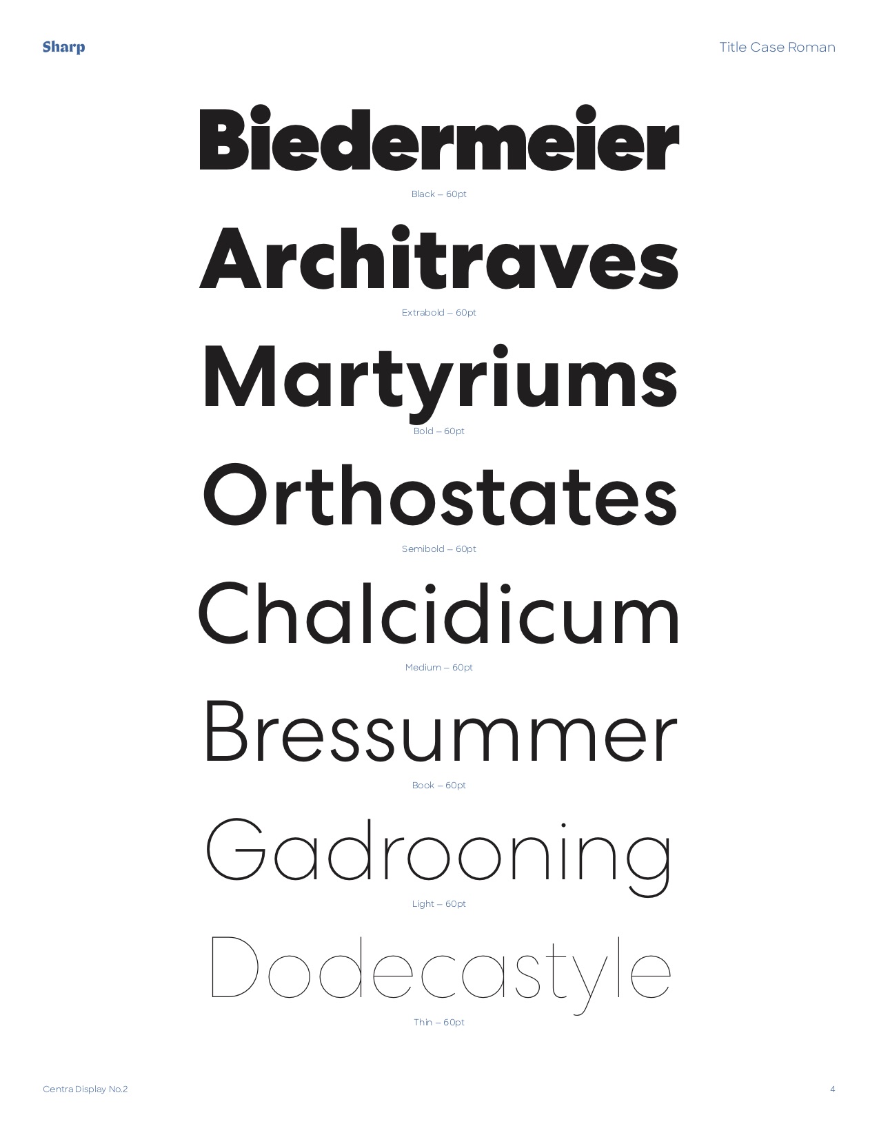
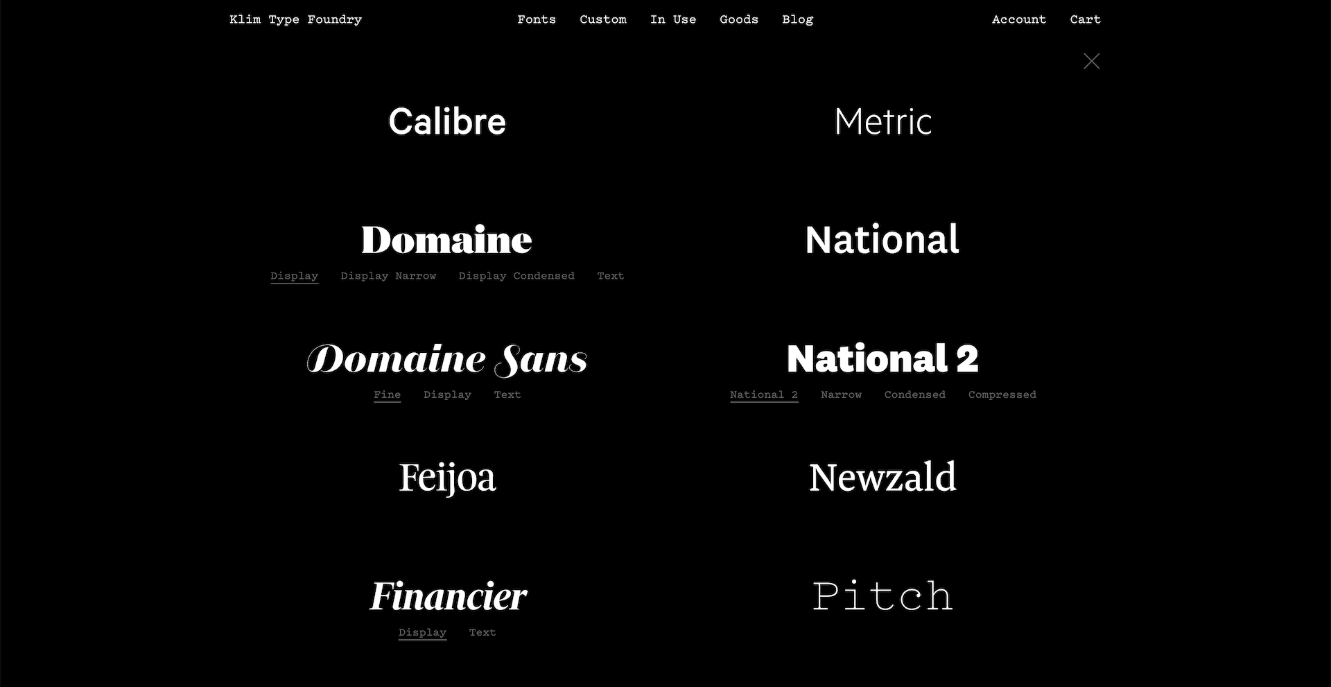
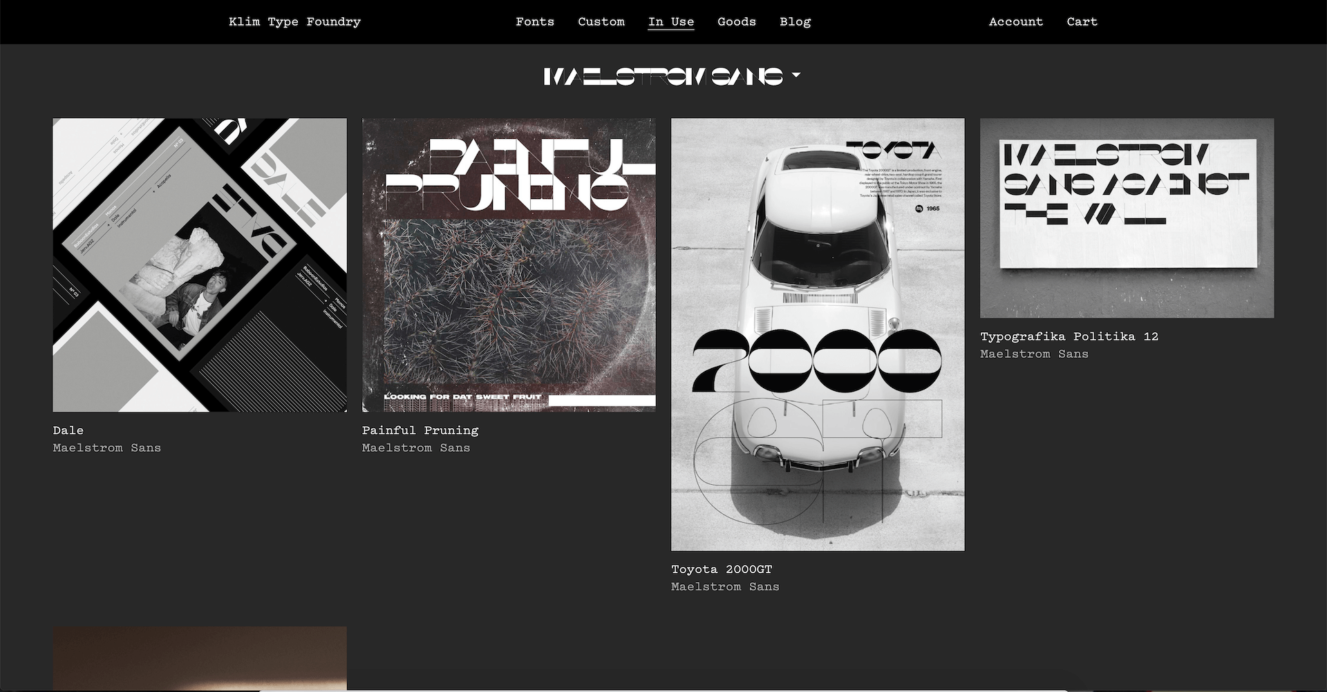
A studio in New Zealand that was established in 2005 by the typographic designer Kris Sowersby. His fonts combine historic knowledge with contemporary meticulous execution. Together with Kris, working the talented designer Noe Blanco, who’s responsible for the technical parts in the designing of the fonts. They have incredibly good looking fonts.
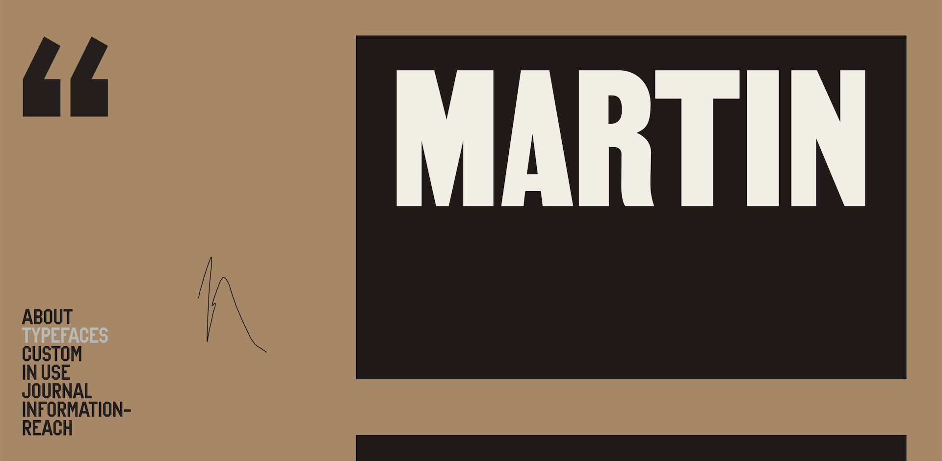
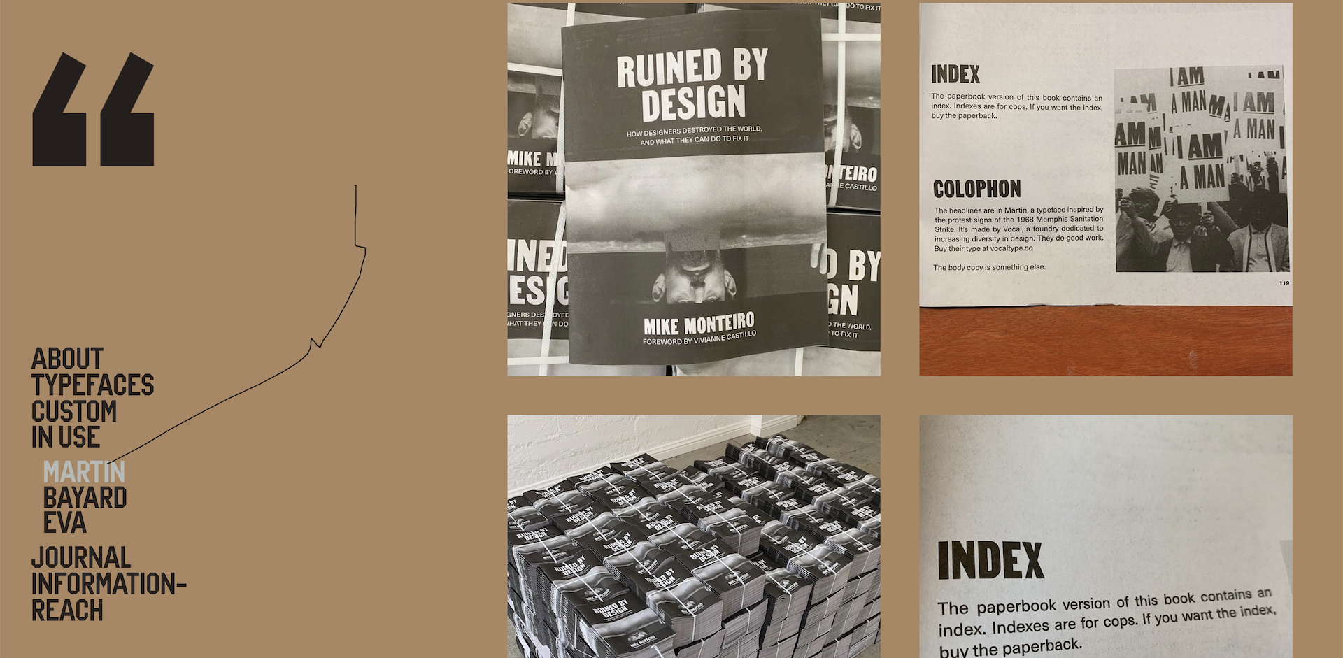
A small American studio of Tré Seals, a graphic designer who decided to express his protest- regarding not having enough black designers throughout American history – through typography and fonts. The type designs are inspired by protest signs and store signs from the 20th century, and they are spectacular. Great for vintage and 60s lovers.
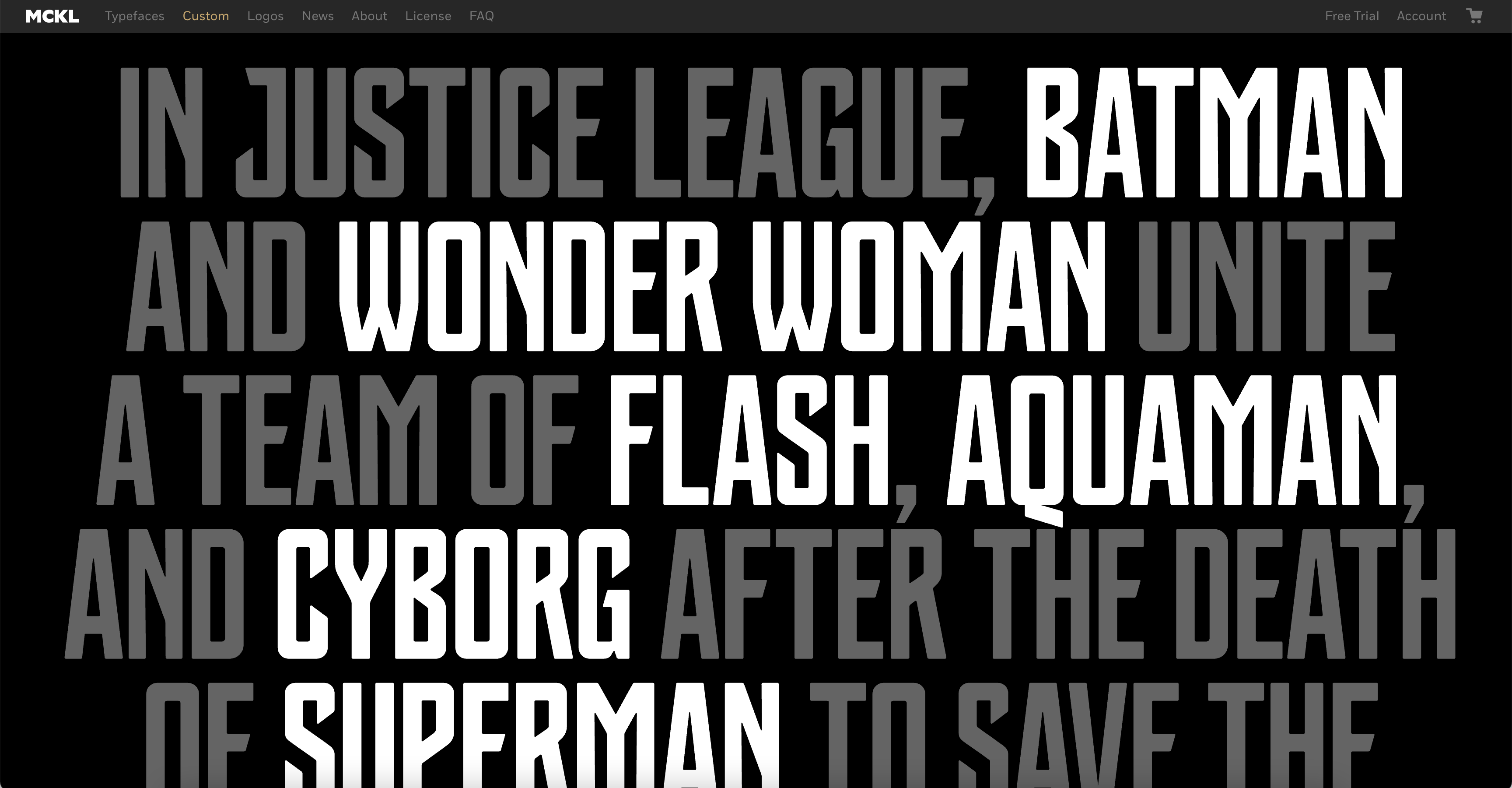
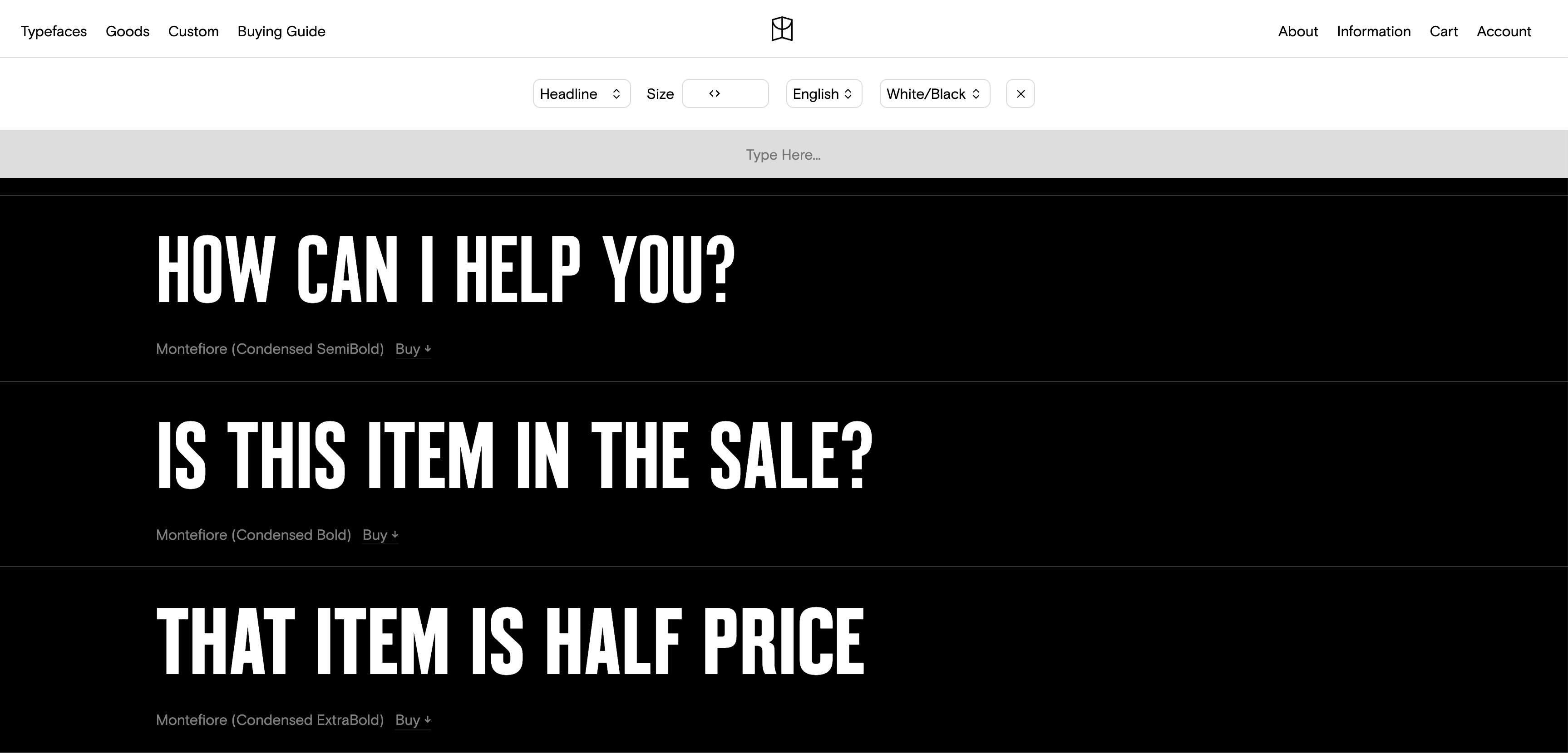
A small studio of Jeremy Mickel, an American graphic designer from Los Angeles, that offers fonts for sale for the wide audience as well as custom fonts for corporations (such as Warner Bros. Uber, Adidas, DC’s Justice League and more). His fonts are relatively solid, versatile and most of them are a pretty safe bet.
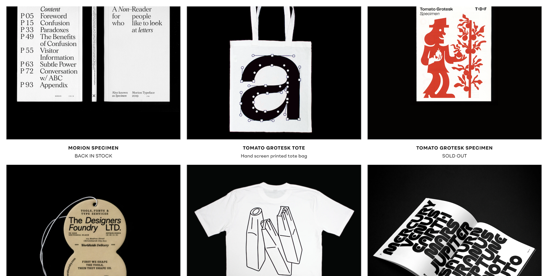
In 2012, eight typographers from all around the globe came together to form a marketplace for high-end fonts. The known ones include Anthony Burrill and Leta Sobierajski. With dozens of fonts families, they offer a very wide range of variety. Consider peeking at the prints section on their website, there are printed typographic products that are fun to hang in the office.
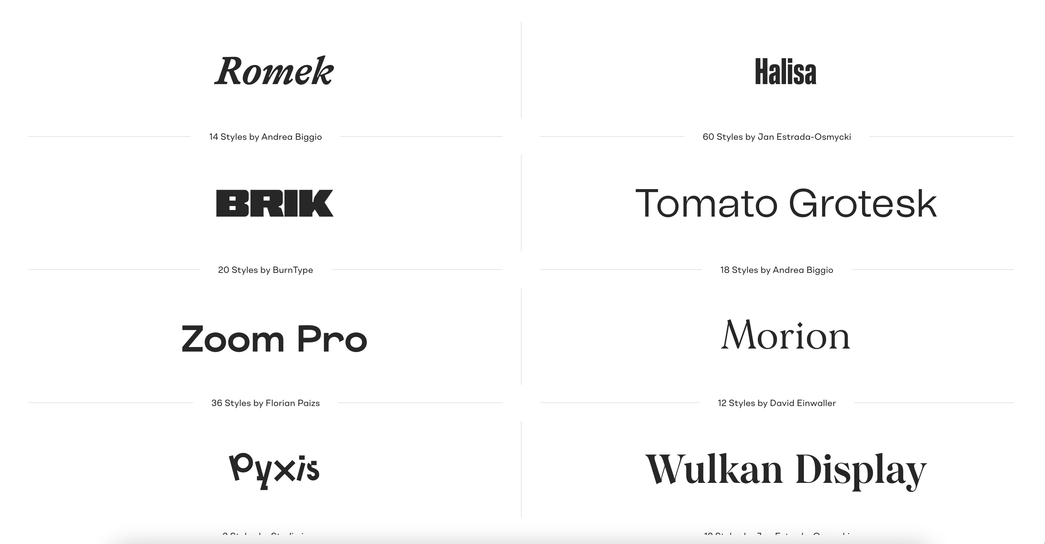
The Chef’s recommendation: Function, Super, Para Supreme, Brik, Morion.
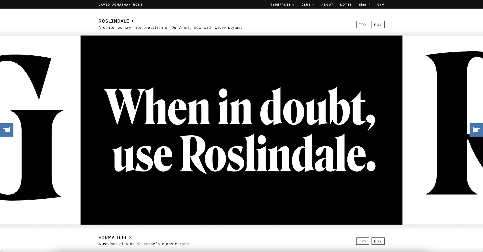
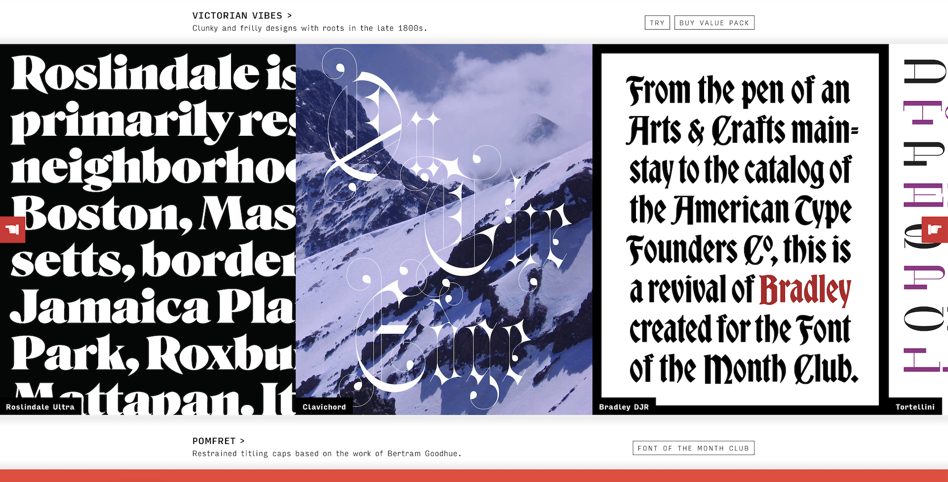
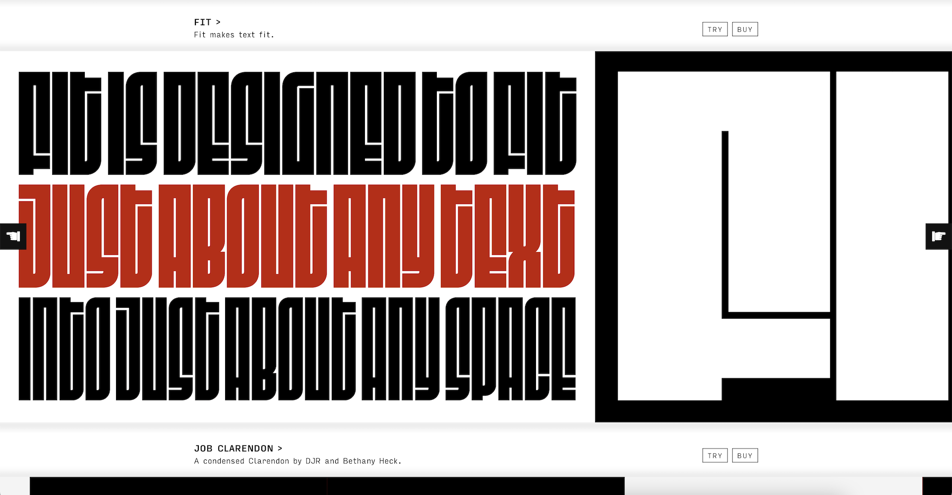
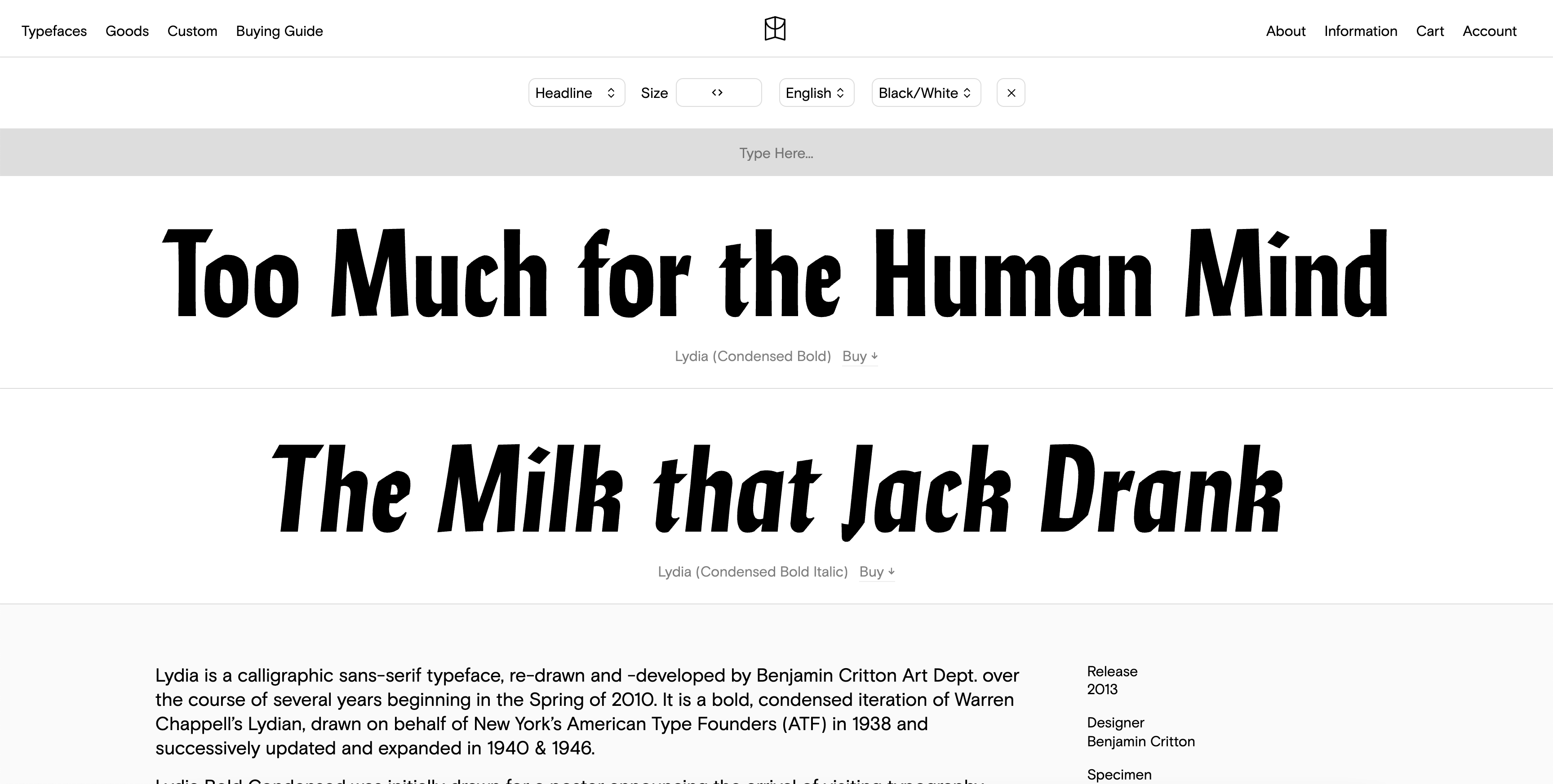
David Johnathan Ross is one of the most known typographers in the American graphic design world in recent years. Along his font designs, Jonathan Ross gives masterclasses and lectures in the most prestigious conferences in the world. He custom draws letters and fonts for designers and for the public. He was born in LA, and lives in the woods of west Massachusetts.
He began sketching fonts in New Hampshire College and joined Font Bureau in 2007, where he polished his typographical skills. Currently, he is publishing the letters he designed at his fonts company- DJR. David works on projects with Type Network, and he develops unusual fonts for his club ‘Font of the Month Club’. I met him in New York, and he’s a real sweetheart.
The avid readers will recognize his collaboration with Oded Ezer on the font ‘Fit’.
Is it okay to be attracted to fonts? Do I need to go to the doctor? Don’t answer me. In the case of Colophon, a studio based in London and LA, that compounds the three typographers Edd Harrington, Benjamin Critton and Anthony Sheret, I have an extreme desire to buy ALL of their published fonts. This is a serious problem. It’s pretty rare to find a studio that almost all of its fonts are usable for a great variety of graphic design needs. With them – it’s exactly the case, and I already grabbed several fonts in my shopping cart.
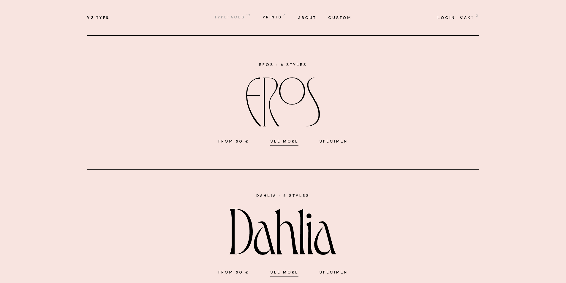
A Parisian studio with great fonts for headlines, by the design agency Violaine & Jeremy. They have few fonts, but each one is like a bonbon. A typographic candy shop, for sure.
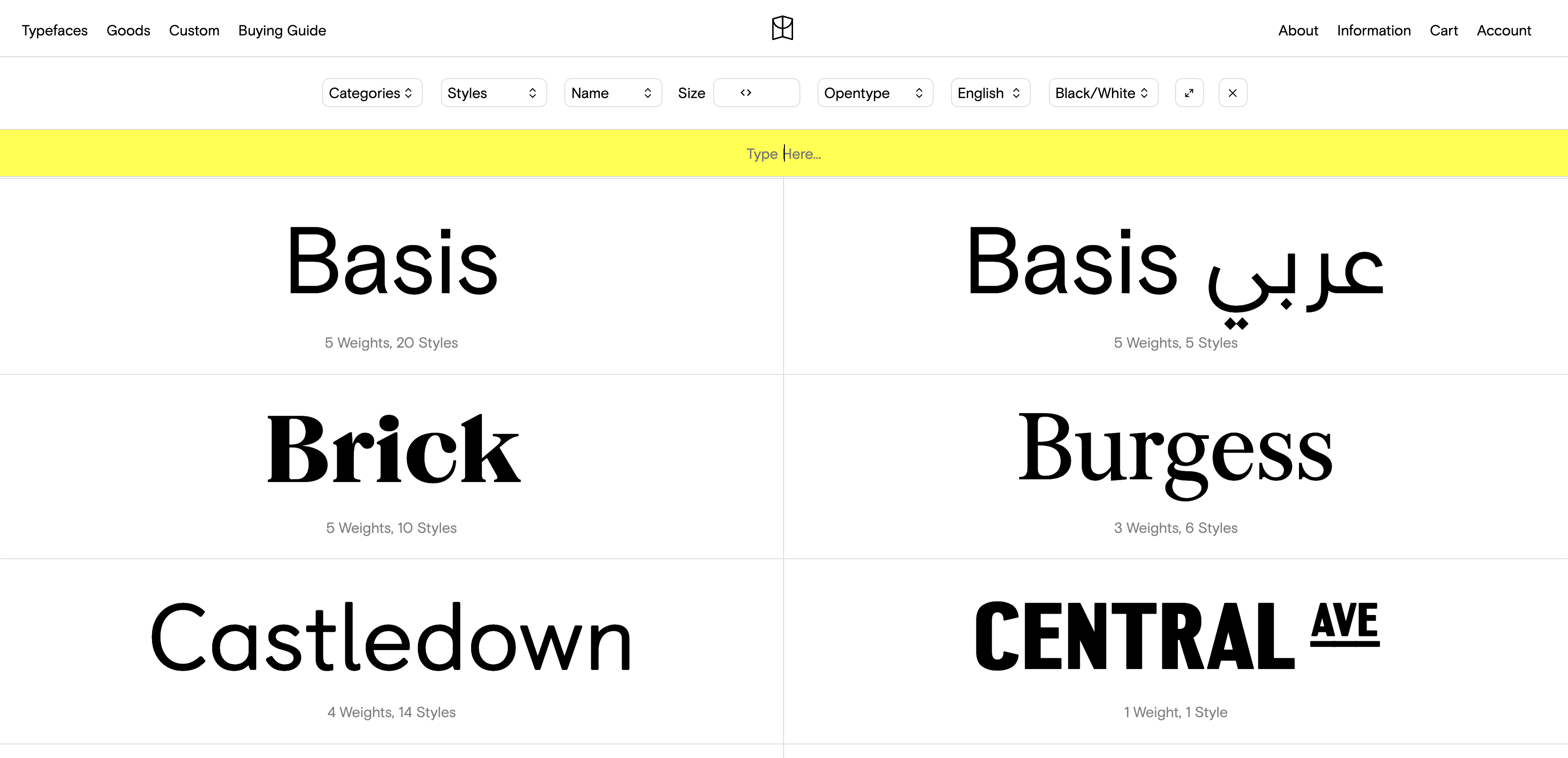
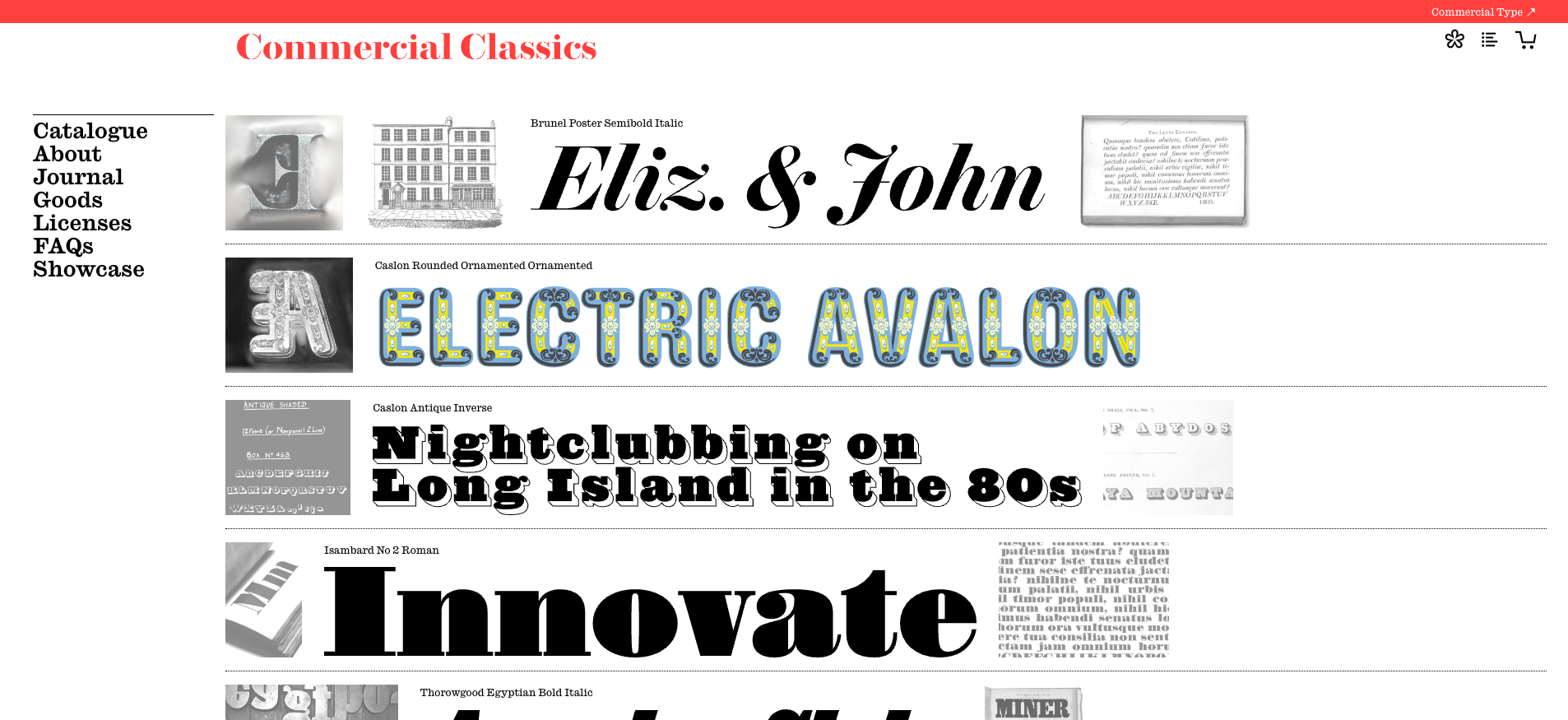
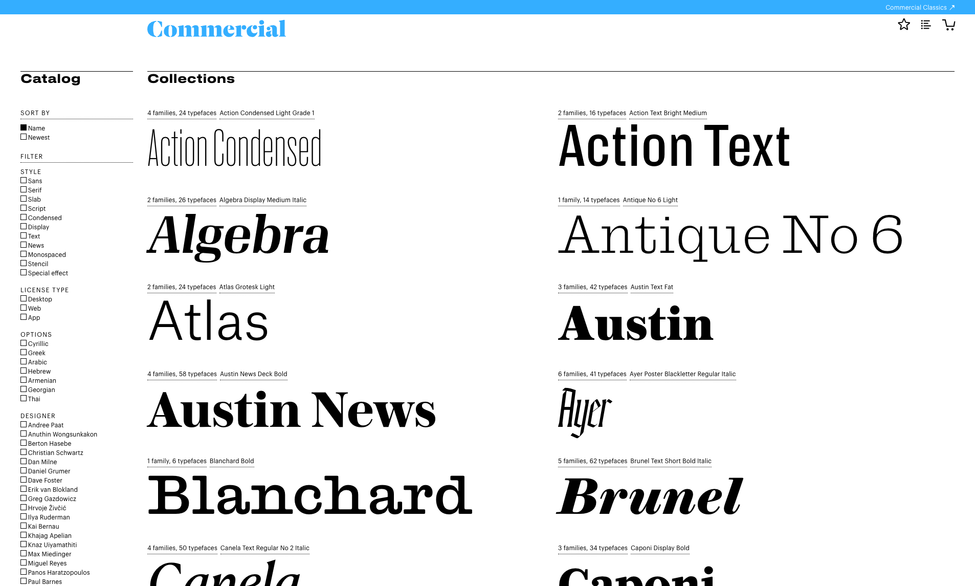
One of the largest studios in the world with hundreds of fonts. While the main website includes pretty “chill” fonts that are easy to use for a variety of needs and branding, the real treat lies under ‘Classics’, where you can find replications of ancient fonts from many different sources.
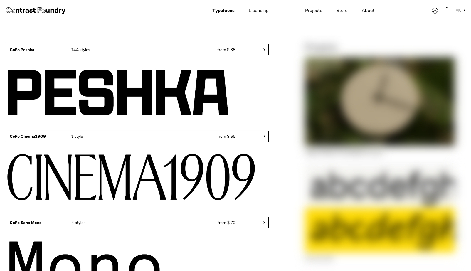
An American studio based in California. They have a small collection of fonts, but most of them with many different font weights for a variety of uses. It’s a shame that the user experience on their website is too complex, but a persistent effort with the desktop version can lead you to beautiful typographic destinations.
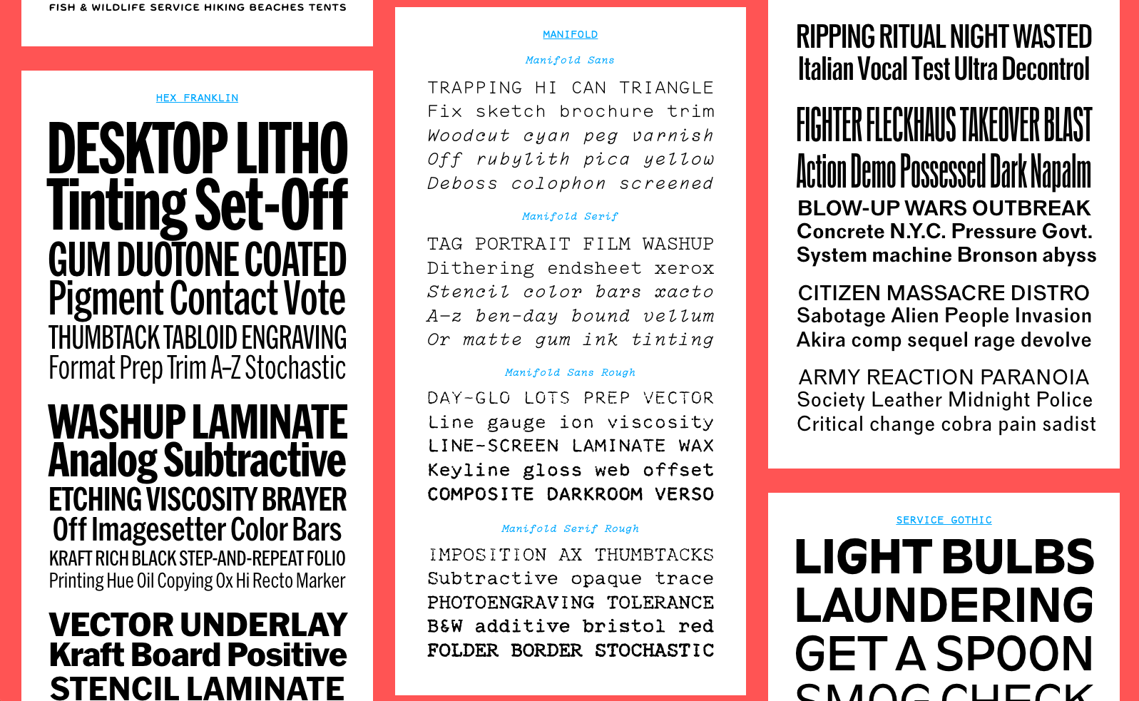
Nick Sherman is a designer, photographer, and one of the most interesting typographers in the American design realm. He is a co-founder of ‘Future Fonts’ (mentioned above). In his project ‘Hex’, he restores ancient fonts, for example, the very loved font family ‘Franklin’, along with some new creations of gothic, grotesque, serif and sans-serif fonts. A treat for the eyes.