From an Italian Grandmother to a Sports Car: Danielle Shami’s Secret Recipe for Branding That Makes You Hungry
Tal Solomon Vardy
Graphic Designer Danielle Shami translated a longing for a New York deli and the aesthetics of Italian sports cars into a visual identity for a “Paninoteca” in Belgrade. A behind-the-scenes look at a brand that isn’t afraid of a little mess, dirt, and dripping food.
How did you get to this project in Belgrade?
“It started when I designed Ram Hertz’s French bakery there a few years ago. I had a project that started a bit after COVID, and he reached out to me because of a tag I did for Assaf Granit’s ‘Shabor’ restaurant. He started following me on Instagram, and then suddenly all the COVID chaos hit, and he said, ‘Okay, I’ll wait for her to get out of the hospital’ (‘Patient 74’). Out of nowhere, he contacted me and we started working together. A few years later, Roberto Bellissimo – an Italian-American who worked with him and knew the bakery we’re talking about – reached out to me.”
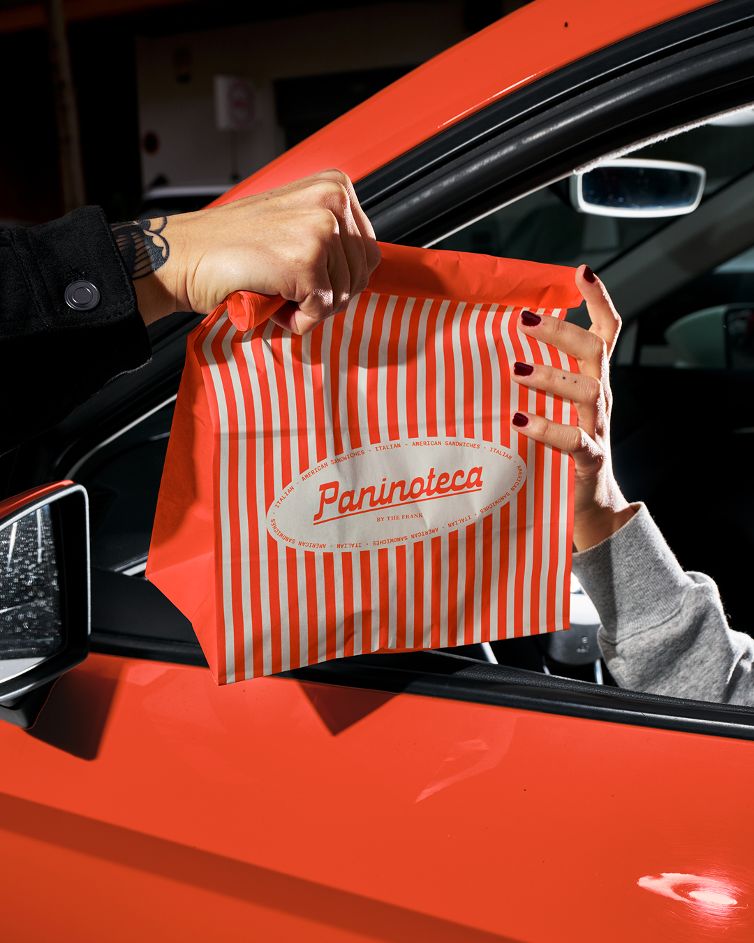
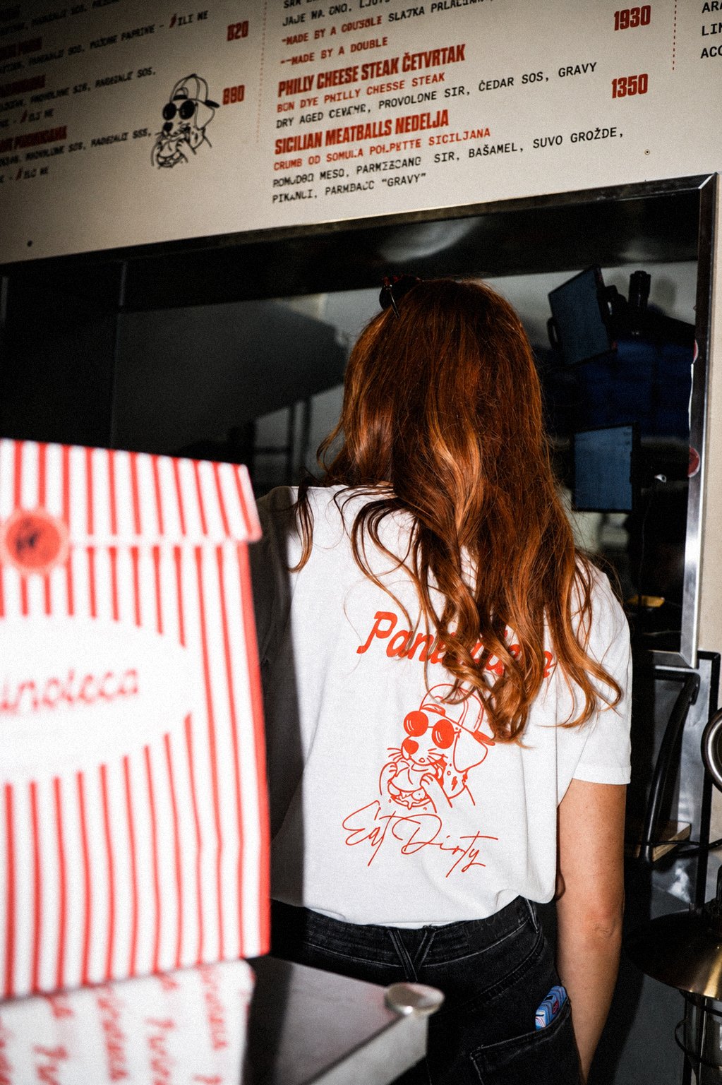
Paninoteca. Design: Danielle Shami, Photo: Katarina Tadić
Does the concept change from the moment you receive the project, or does it stay the same? How do you start the preliminary research for the branding?
“The concept was pretty much the same. I took inspiration from New York delis, and something that is also warmer. I really imagined you coming in and getting your sandwich, this juicy thing, and there’s something a bit family-like about it.
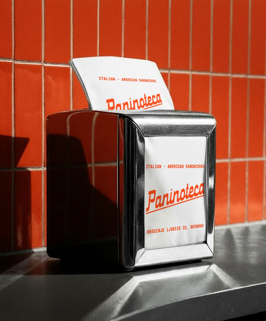
With ‘Paninoteca’, we wanted to build a world that feels like a meeting point between Italy and New York. The logo draws inspiration from the world of Italian sports cars of the 1970s – the ‘Italian wedge’ – when the world of Italian design was full of character, iconicity, and a sense of style, but it also references the old-school Italian delis of New York, a grandmother preparing a comforting meatball sub, and the old-fashioned neighborhood deli aesthetic. The connection between these two worlds created an identity that feels nostalgic, yet modern.”
What’s the story with the dog in the logo?
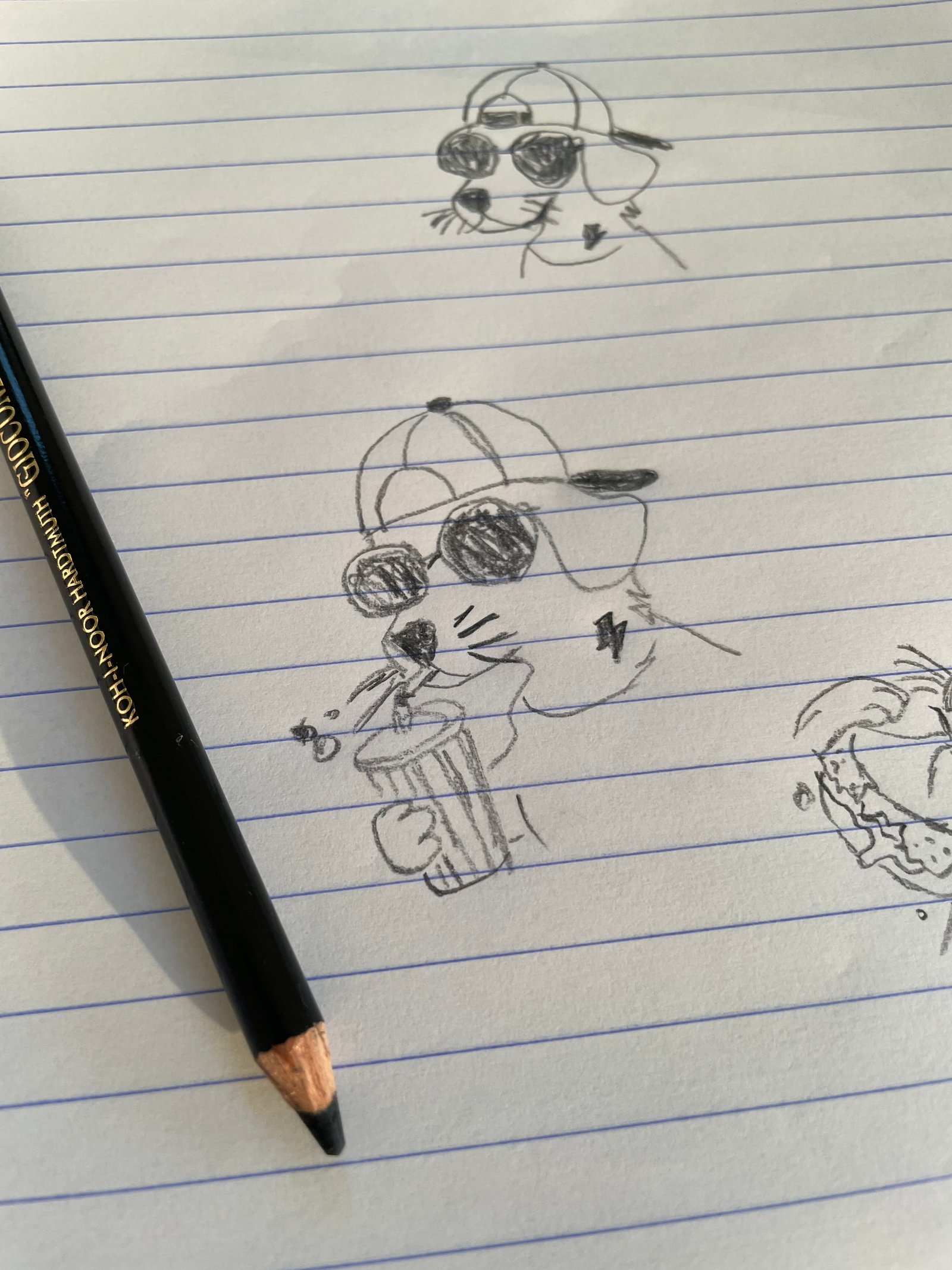
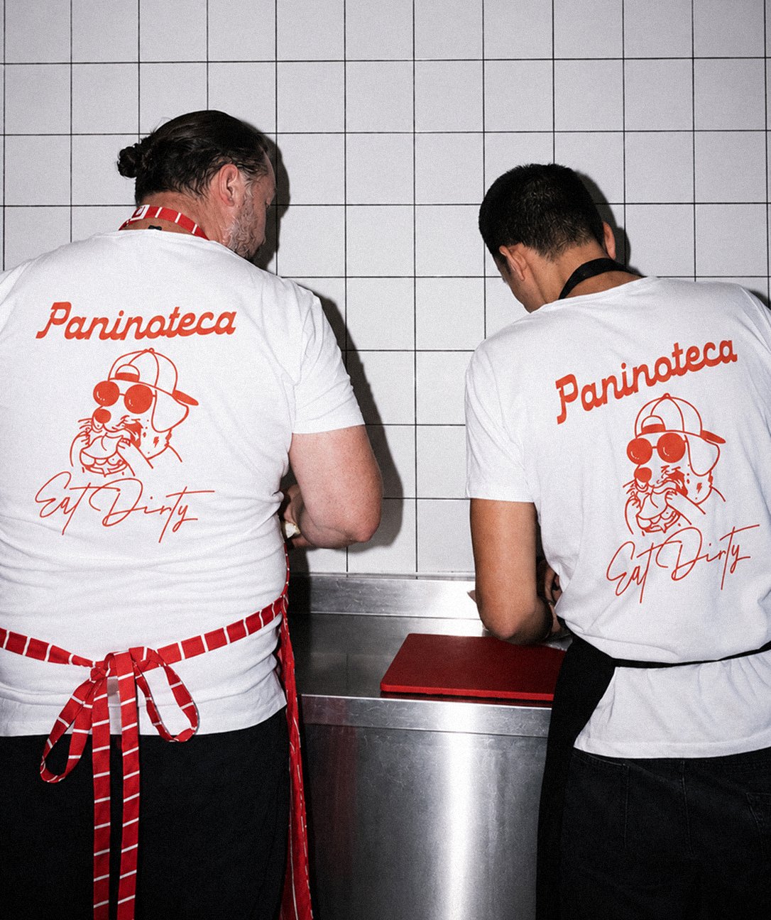
“Right, so it started with the general branding language, and slowly the idea of ‘The Frank’ came up – our symbol, our mascot. I really wanted a cat! It felt much more New York to me; ‘Frank the Cat’ is something a bit rougher around the edges. He is less of a cat person (laughs), but in the end, he wanted to go with his sausage dog.
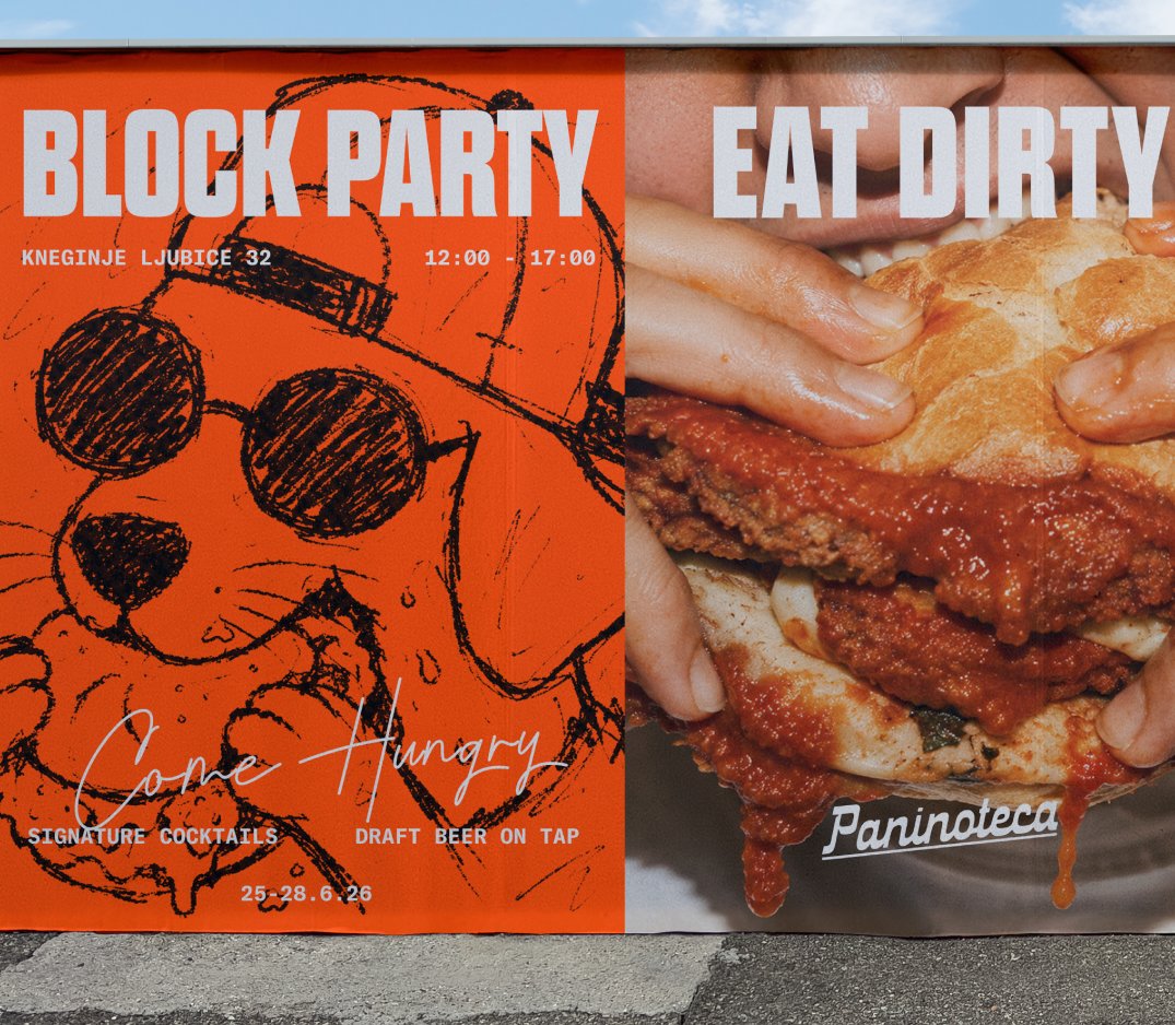
We started playing around with it. It’s ‘Paninoteca By The Frank,’ even though we don’t use the full name. Slowly, we started creating more graphic elements and posters with illustrations and animations, and he is totally on board with everything. Now we are making a branded beer with ‘The Frank,’ and it’s really fun.”
Frank. Design: Danielle Shami
Paninoteca. Design: Danielle Shami, Photo: Katarina Tadić
Does the actual printing happen there, or is it somewhere else? Do you travel there?
“No, I was supposed to fly there to do a campaign, but it’s no longer cost-effective to fly out from Israel. I’m with him every step of the way, doing tests. Surprisingly, the prints came out amazing, exactly how we wanted them. The execution is really, really fine.”
I wonder, how do you brand without tasting? Can you imagine Italian-American food?
“I think taste is only one part of the brand. When I approach designing a restaurant or any other brand, what interests me is the story and the experience the brand conveys. From the moment someone sees a post, passes by the sign on the street, or holds the packaging in their hand, a certain feeling is built. If every touchpoint feels deliberate and consistent, it creates a complete experience that goes far beyond the food itself.
I always try to build a sense of belonging. To take the person to another place for a moment, even if only for a few seconds, and make them feel something.”
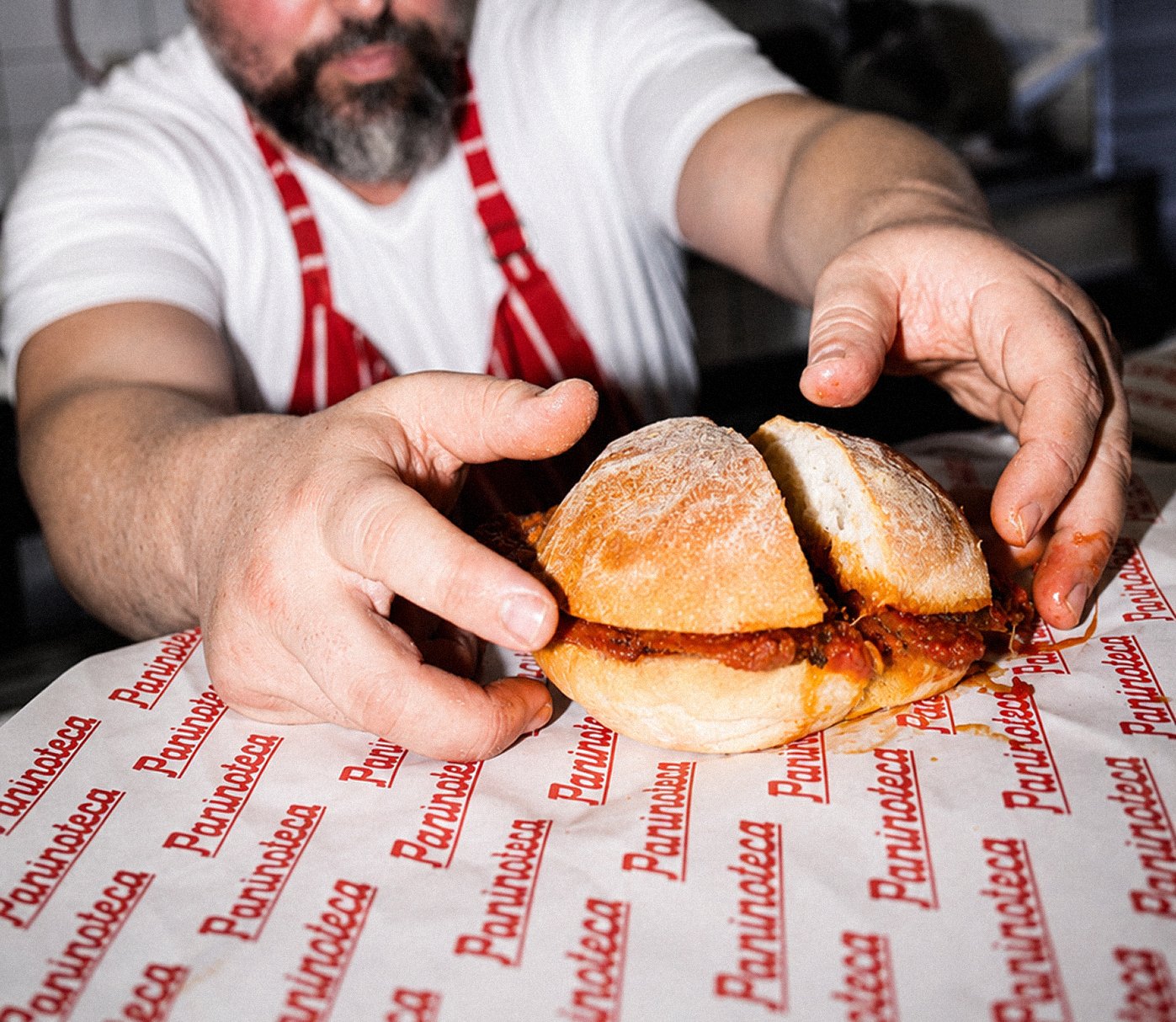
Paninoteca. Design: Danielle Shami, Photo: Katarina Tadić
Paninoteca. Design: Danielle Shami, Photo: Katarina Tadić
Were you also in charge of the art direction for the photoshoots? What were the references?
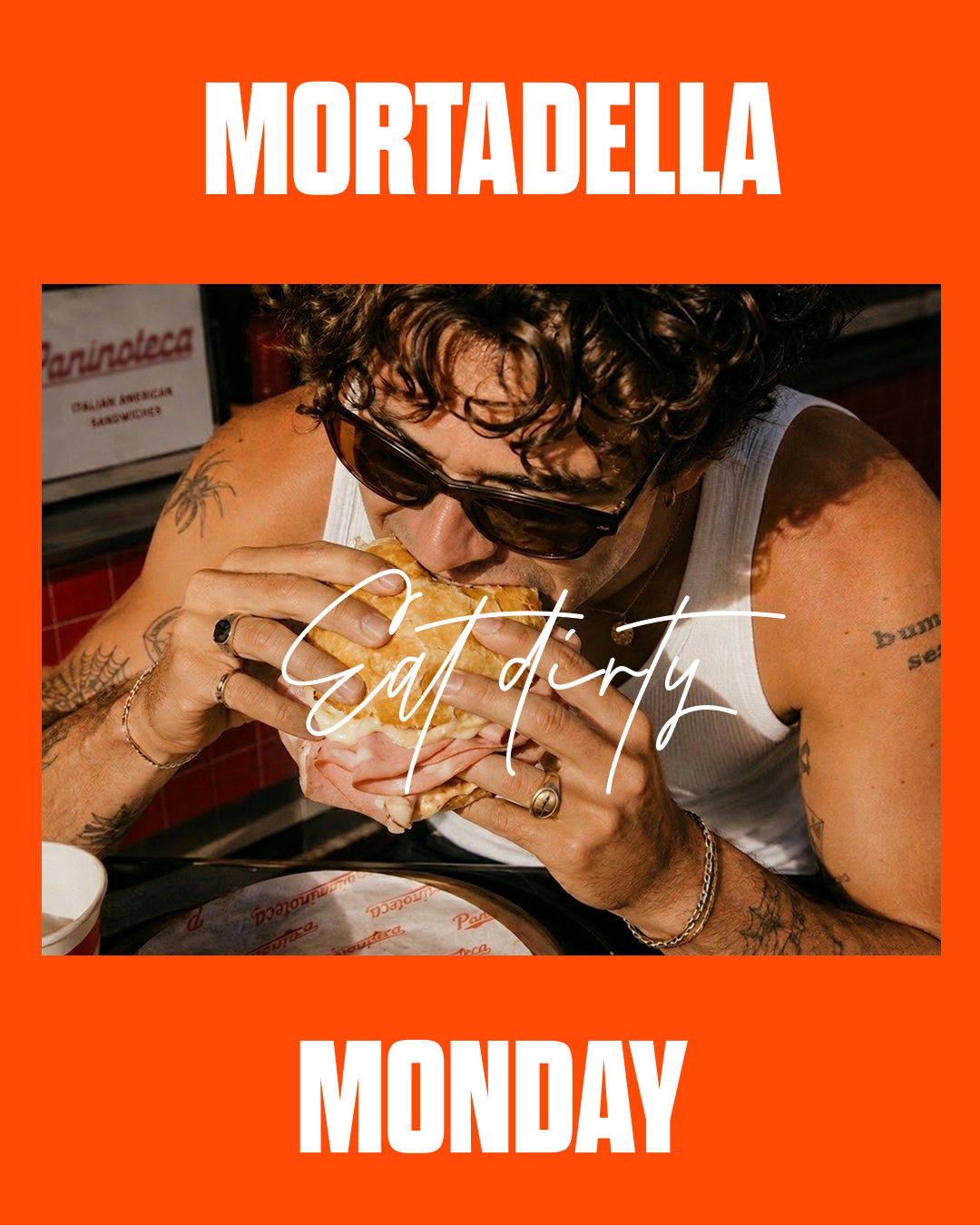
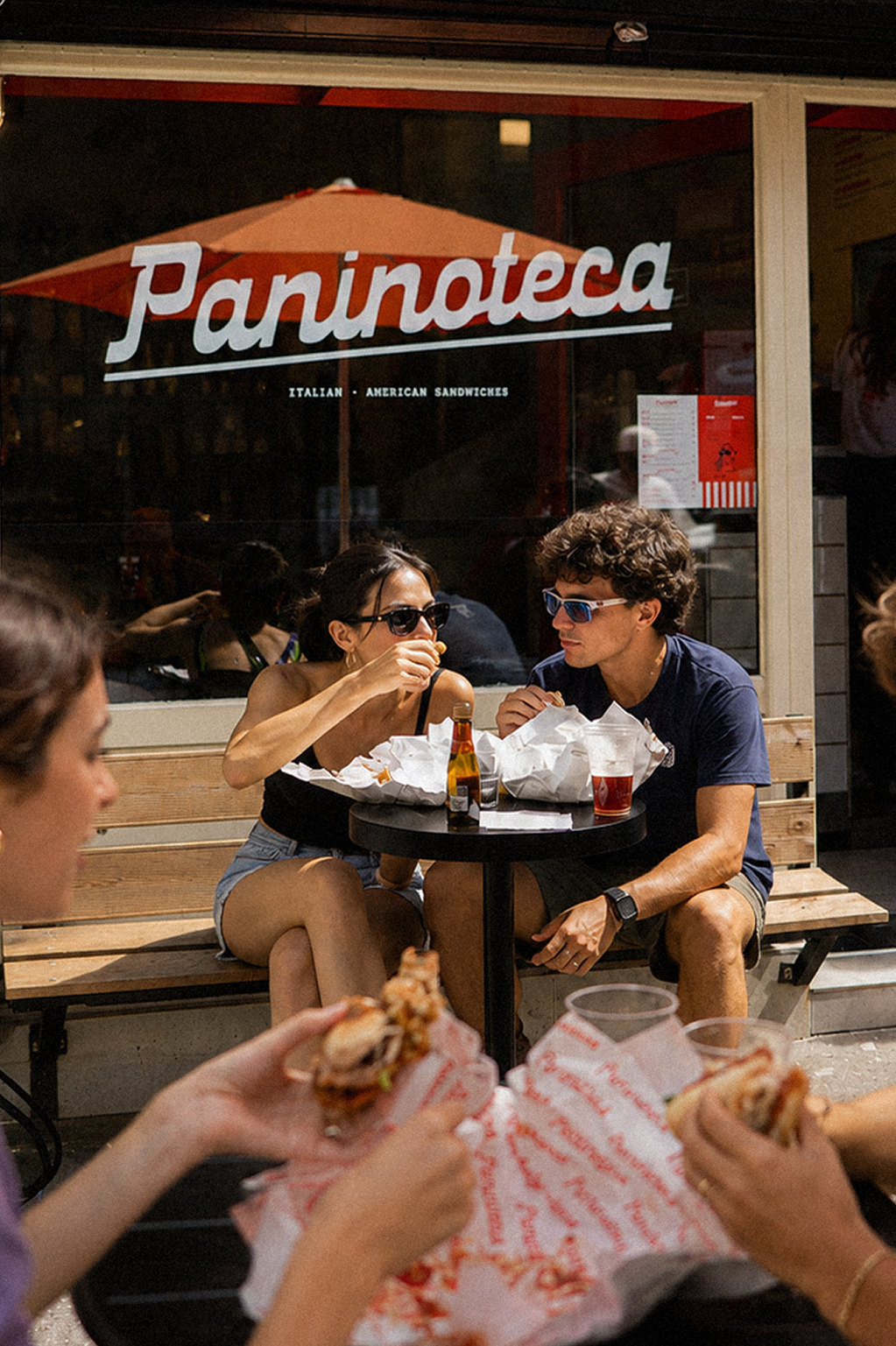
“The goal was to show something that isn’t perfectly aesthetic – just people in the middle of eating, meaning we wanted to have that messiness in there. I built the mood board and sent it to the photographer, Katarina Tadić, in Belgrade. Sometimes we hit the mark right away, sometimes it takes a few tries. It was extremely important to me to convey that it isn’t clean and sterile.”
Is there anything else you’d like to add?
“The project is really broad and cool, and recently, because of AI, we started doing a lot of things with it, which is pretty funny. They made this really silly video where the dog’s head from the logo appears instead of a human. It’s a bit out-of-character for the brand’s vibe, but on the other hand, it’s hilarious. The client’s flow is so fun – how many things you can actually spin off from the exact same thing. And now, it also feels endless in a way.”